"The Shakers knew a good trick: Paint your interiors in yellow and it'll look as though the sun is streaming in, even on grey days. Perhaps that's why we're noticing the palest of pale yellow all over the place. Just a hint more buttery than off-white or cream, it's a more diluted version than the butter yellow of the last couple of years-perfect for the color-shy."
"Have a look at 7 spaces done in pale yellow-the next color set to take over the kitchen. Above: A Tudor-style kitchen in northern California, redone in Farrow & Ball's Pale House No. 71 by Lauren Geremia of Geremia Design. See more in 10 Easy Pieces: Architects' Favorite Butter Yellow Paint Picks (though we say this is on the paler end of the spectrum). Photograph by Laure Joliet for Geremia Design."
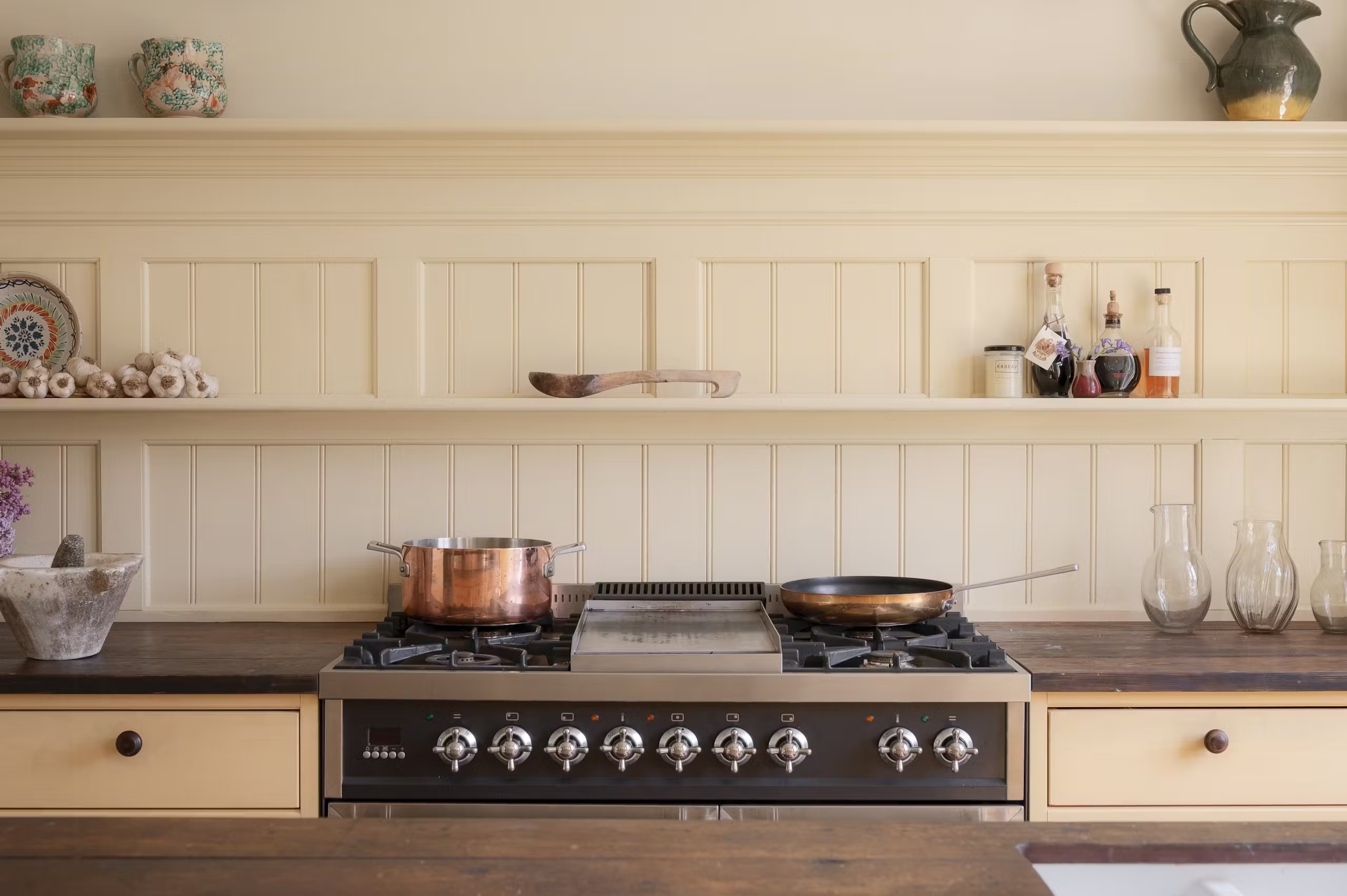
"Above: A kitchen on the Danish island of Bornholm is done in "a considered palette of pale yellows-85 Vintergul and 86 Strandgul from Linolie & Pigment." Photograph (and featured photograph up top) from Kitchen of the Week: A Restored Early 20th-Century Kitchen on Bornholm. Above: Pale yellow meets butter yellow in this English galley kitchen, as seen in The Gardener's Cottage Guesthouse: A Project by "Intuitive Antiques Dealer-Decorator" Max Rollitt. Photograph by Chris Horwood."
Shakers used yellow interiors to make spaces feel brighter, as if sunlight were streaming in even on grey days. Pale yellow is now appearing widely, described as the palest shade—slightly more buttery than off-white or cream. It is positioned as a diluted version of butter yellow that suits people who want a subtle color change. Examples include a Tudor-style kitchen in northern California painted with Farrow & Ball’s Pale House No. 71, a Danish kitchen on Bornholm using pale yellow tones from Linolie & Pigment, and an English galley kitchen combining pale yellow with butter yellow. The next kitchen color set to take over is pale yellow.
Read at Remodelista
Unable to calculate read time
Collection
[
|
...
]