"In my work as a product designer at Appspace, we've wrestled with this countless times. Should we really give that feature to users, or are they going to abuse it? For example, in our editor for internal communications, we have to determine what the best defaults should be to improve usability for the majority, rather than allowing every user to adjust settings to their liking."
"The response advocating 'just change the color' and 'go into accessibility settings' completely misses the point of user-centered design. The focus should be on creating an experience that doesn’t require users to dive into settings to improve usability."
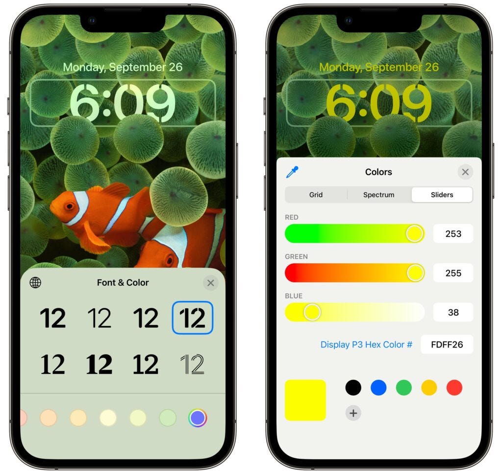
The author shared dissatisfaction with iOS26's readability after testing the beta. Igniting a debate, the creator received criticism for calling attention to the problem, with responses like 'just change the color' or 'use accessibility settings'. The writer argues that while accessibility features are valuable, they divert focus from intuitive design. Good default settings should enhance user experience without requiring adjustments, reflecting a broader concern about shifting design philosophies at Apple that prioritize aesthetics over usability.
Read at Medium
Unable to calculate read time
Collection
[
|
...
]