"I think when we talk about typefaces and fonts, most people think of it as sort of one giant, monolithic thing, but there is a distinct division between the type that has some emotional resonance or communicates a vibe on top of the actual meaning of the words."
"The first decade of this century, and probably the last decade of the last one, I was obsessed with clear text typography and finding the appropriate typeface and the best setting for it, to sort of move typography out of the way of the reader."
"Way beyond, whether it's serif or sans serif, there's this gigantic division in type between the stuff that you can see and pay attention to the details of and the stuff that functionally washes over you."
"I've spent probably equal amounts of time looking at macro and micro. The typeface that I designed with Juan Villanueva for M&M is a highly expressive typeface."
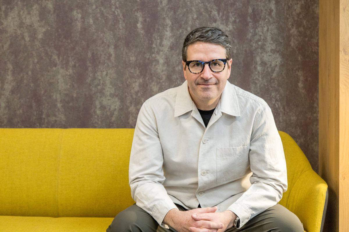
Charles Nix, a senior executive creative director at Monotype, discusses his lifetime involvement in typography, beginning from a 'charmed typographic existence' thanks to his father's printing background. He highlights the need for recognition of type's emotional and functional elements and notes that the rise of digital technology has popularized type's significance. Nix balances his work between highly expressive typefaces like the one he designed for M&M and more functional designs. He emphasizes the complexity of typography beyond mere classification into serif or sans serif.
Read at Creative Bloq
Unable to calculate read time
Collection
[
|
...
]