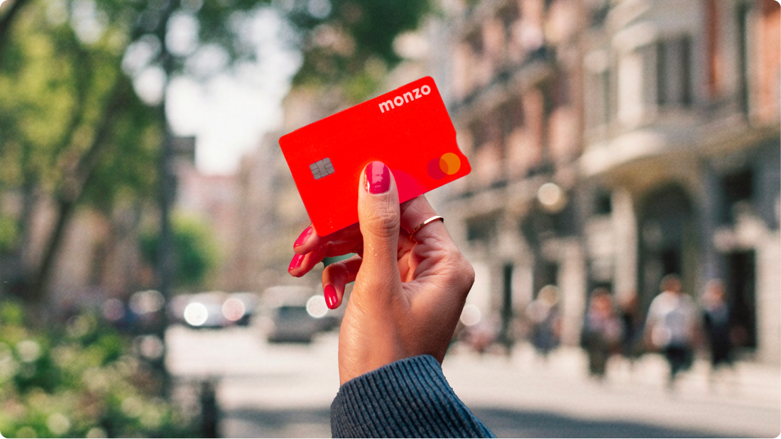
Most bank cards have traditionally used subdued colours, but some providers introduced bright, distinctive designs. A bright card can be a security risk if it is lost or falls out, because it may be easier for others to notice and pick up. No direct published studies compare pickpocket rates or recovery rates between vivid and discreet card colours. Adjacent evidence suggests card colour can create consequences beyond what designers intend. One example is a coral Monzo card, originally proposed by a designer under time pressure after seeing hot coral trainers. The colour was intended for a beta phase to signal early-adopter status, but it also drew attention in public places and prompted strangers to ask about it.
"There is a sensible argument that an attention-grabbing, colourful debit card is a security risk. If it falls out of your pocket on the night bus, a hot coral rectangle on a dark seat catches the eye more than a black one. Easier for you to find in the morning, sure. Easier for the person sitting next to you, too. So which effect wins?"
Read at Medium
Unable to calculate read time
Collection
[
|
...
]