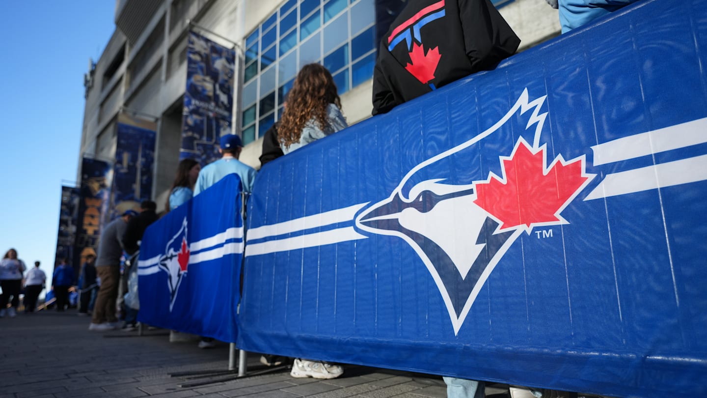
"Every minuscule detail of the logo was meticulously planned and tweaked. From the exact shade of blue to the balance between the bird, baseball, and maple leaf, the design feels intentional in a way few expansion teams manage to pull off. The pleasant colour scheme paired with a slightly cartoonish blue jay gave the logo warmth and approachability, without sacrificing legitimacy or seriousness."
"The team name and logo were introduced before the 1977 inaugural season, with famed designer Richard Walker overseeing the task of producing the team's visual identity. Walker, who was also involved in the creation of the iconic Montreal Expos logo, worked closely with Labatt Brewing Company (the team's owner at the time) to create a look that would feel distinctly Canadian while still fitting comfortably within Major League Baseball."
The Toronto Blue Jays celebrate their 50th season and unveiled a 50th-anniversary logo. The original 1977 logo, designed under Richard Walker with Labatt Brewing Company's input, featured a slightly cartoonish blue jay, a baseball with an embedded maple leaf, and a carefully selected blue palette to convey Canadian identity and Major League legitimacy. Every logo detail was meticulously planned to balance warmth, approachability, and seriousness. A 1997 redesign modernized the mark with darker tones and a more serious blue jay head while retaining familiar elements to maintain continuity with the franchise identity.
Read at Jays Journal
Unable to calculate read time
Collection
[
|
...
]