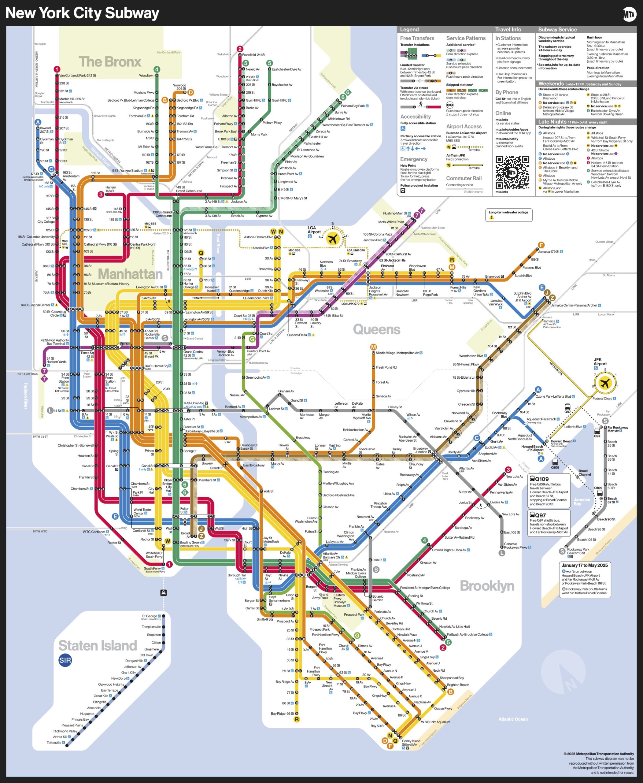
"The Metropolitan Transportation Authority is updating its subway map, focusing on readability and ease of use rather than strict geographic accuracy, a first in 50 years."
"The new design employs bold, straight lines and vibrant colors to enhance visibility, making it more ADA-friendly and suitable for digital platforms and users with low-vision."
"With this map update, the MTA aims to improve passengers' travel experience, following the influence of the 1972 Vignelli design that emphasized simplicity and functionality."
"This change signals a shift in public transportation mapping, prioritizing user experience over strict geographic representation, catering to the needs of modern subway riders."
The MTA is releasing a new subway map that emphasizes readability and user accessibility, departing from strict geographic accuracy. Designed by the Creative Services Mapping Department, it features bold lines and colors, making it suitable for digital users and those with vision impairments. Key changes include single-line text placement and improved contrast for easier reading. This update, inspired by the 1972 design by Massimo Vignelli, marks a significant shift in transit mapping, focusing on enhancing the travel experience for riders in the underground environment.
Read at FlowingData
Unable to calculate read time
Collection
[
|
...
]