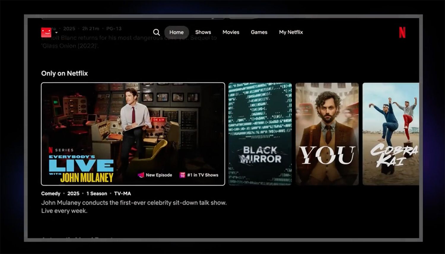
""The way that the old home page is built, you kind of see box art, box art, box art, box art. It's kind of suboptimal, right?" says Eunice Kim, Netflix's chief product officer, speaking to the New York Times this week."
"As Netflix's user base has grown from around 30 million subscribers when that old homepage came into being, to around 300 million now so has the share of users who come to the app not knowing what they want to watch."
"The real goal of this is, how do we make it easier, how do we make it simpler, faster for you to make a great decision?" says co-CEO Greg Peters, speaking to the Times."
"The new design features a navigation menu across the top of the page and highlighted feature titles in each row, which aims to improve user experience."
Netflix is set to launch a significant redesign of its appâs homepage, the first since 2013. The overhaul aims to enhance user experience by simplifying navigation and decision-making for its growing subscriber base, which has risen from 30 million to 300 million. Key features include a top navigation menu, highlighted titles, and more auto-playing video, creating a departure from the traditional box art layout current users are accustomed to. Executives emphasize the redesign's goal is to make content discovery easier and faster for viewers.
Read at sfist.com
Unable to calculate read time
Collection
[
|
...
]