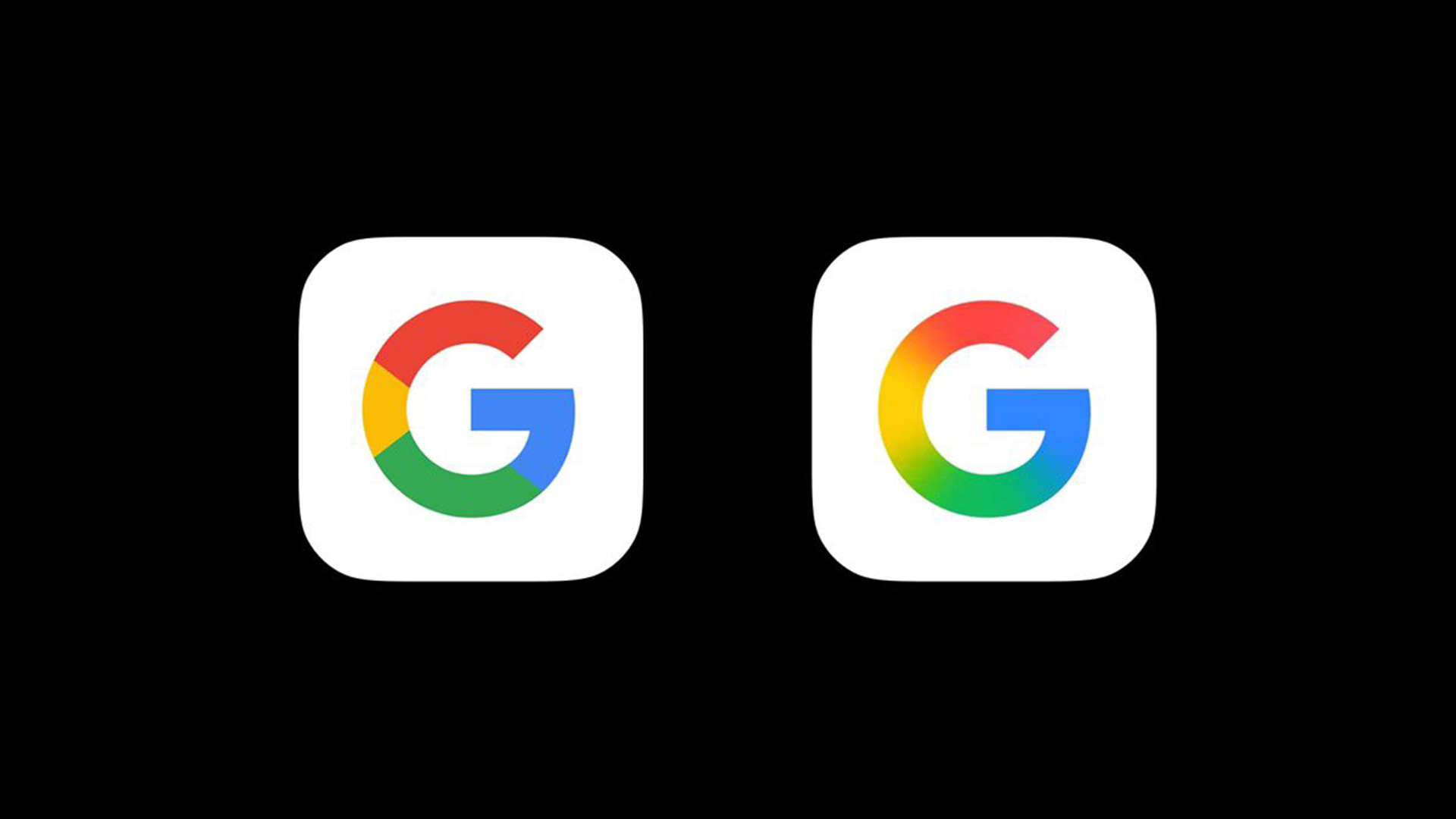
"Makes the current one look dated already. That's a sign of a good design! A rare logo update that actually looks nice."
"Google has blurred the four colours of its 'G' logo into a rainbow gradient, marking a noticeable shift from the previous flat design."
Google has unveiled the first significant update to its logo in a decade, transitioning from a flat design to a contemporary rainbow gradient. This change, which replaces the previous icon for the Google search app on iOS and Android, marks a noticeable departure from harsh geometric designs. Early reactions from users have been overwhelmingly positive, suggesting that this update not only revitalizes the brand's aesthetic but also indicates a broader trend in logo design favoring softer, more modern visuals. The gradient aligns with recent trends seen in other tech logos.
Read at Creative Bloq
Unable to calculate read time
Collection
[
|
...
]