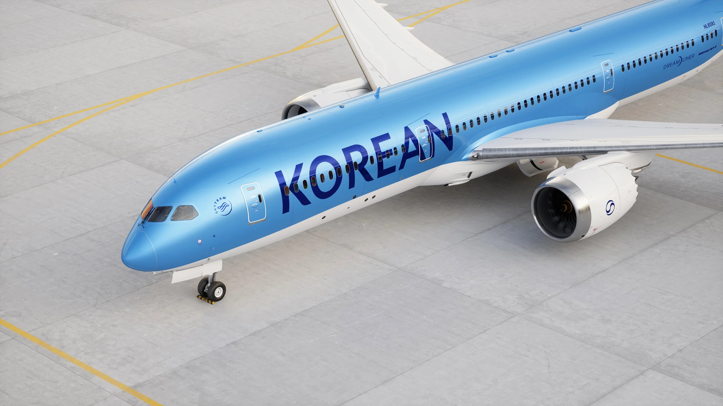
"Korean Air's new branding, designed by Lippincott, refreshes its logo and color scheme, marking the airline's evolution and the integration of Asiana Airlines."
"Korean Air's rebranding comes after its merger with Asiana Airlines, aiming to establish itself as a modern, global airline while phasing out Asiana's identity."
"The new logo, inspired by the Taeguk symbol, signifies a modern take on Korean heritage, showcasing a fluid ribbon design that represents balance."
"Lippincott's Dan Vasconcelos notes that the 1984 branding was 'iconic,' but evolving it after 40 years is a significant step in Korean Air's journey."
Korean Air is set to update its brand identity for the first time in 39 years, introducing a new wordmark, logo, and refined color palette designed by Lippincott. This rebranding aligns with the recent merger with Asiana Airlines, which will see the latter's brand phased out. The new look aims to symbolize Korean Air's transition into a more global brand, differentiating this chapter of its history. The logo reimagines the Taeguk symbol in a modern style, reflecting a commitment to innovation and balance in the airline's future operations.
Read at Fast Company
Unable to calculate read time
Collection
[
|
...
]