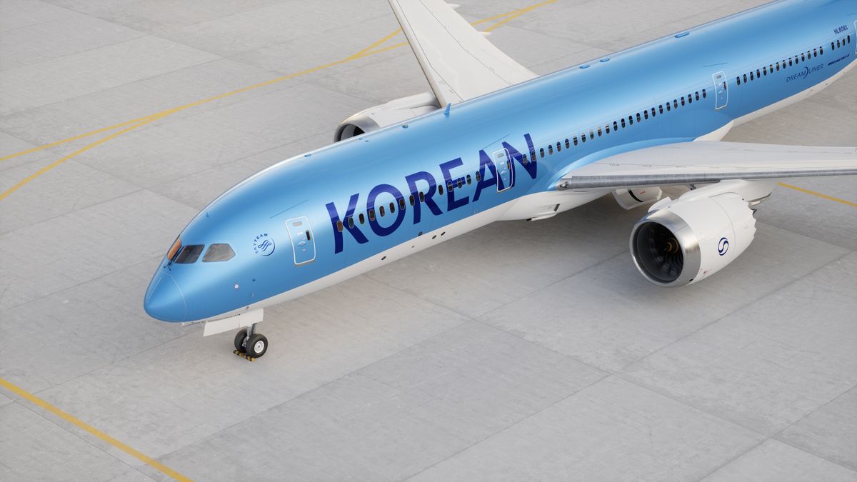
"The new brand identity of Korean Air aims to create a modern premium experience while respecting the airline's heritage, enhancing its status as the flagship carrier of South Korea."
"The rebranding, guided by the 'Excellence in Flight' ethos, focuses on improving Business and First-Class offerings and creating a passenger experience inspired by the hospitality sector."
Korean Air has undergone its second rebranding, marking its first refresh since 1984, as a result of its merger with Asiana. Guided by the brand's 'Excellence in Flight' ethos, the new identity aims to enhance passenger experience, particularly in Business and First-Class, while drawing inspiration from the hospitality industry. The updated logo reinterprets the Taeguk symbol, incorporating elements of traditional Korean dance, Sangmo Nori, symbolizing prosperity. The refreshed design emphasizes modernity and premium service, aimed at establishing Korean Air as the flagship carrier of South Korea.
Read at Creative Bloq
Unable to calculate read time
Collection
[
|
...
]