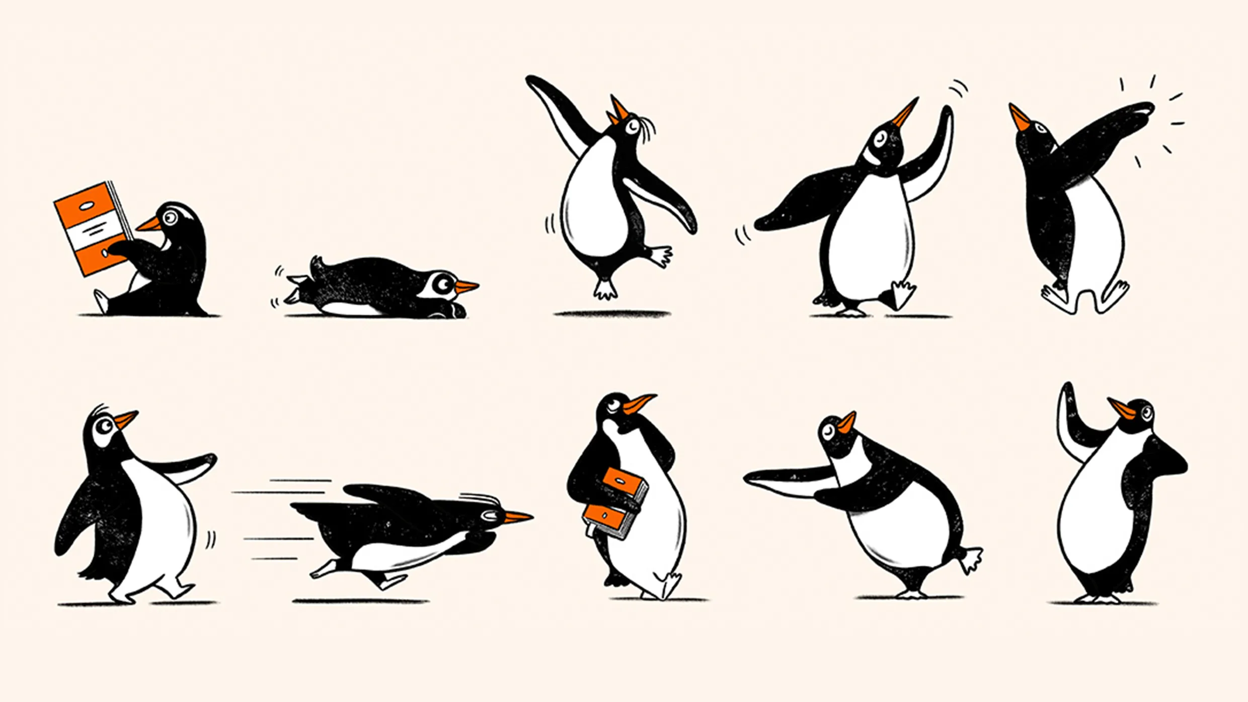
Penguin Random House UK introduced a brand refresh featuring 'Playful Penguins,' a series of hand-drawn illustrations depicting the penguin jumping, dancing, reading, and in various active poses. These illustrations will appear across seasonal campaigns, social initiatives, and point-of-sale displays. Following the 2013 merger of Random House and Penguin Books, the company had maintained a single standardized logo. During the company's 90th anniversary, designers discovered expressive illustrated penguins in the Bristol archive and tested them in campaigns, receiving strong public response. This positive reception prompted leadership to expand the penguin's role in the brand. The orange penguin logo remains the primary mark, while the new Playful Penguins provide guidelines for creative variations as the company approaches its centennial.
"According to Derek Man, Penguin Random House UK's design director, the company had an opportunity to 'test and stretch' its brand for its 90th anniversary last year. At the time, his team uncovered a 'rich collection of expressive illustrated penguins from our Bristol archive,' which they wove through the anniversary campaign. The public showed a major affinity for the bird, demonstrating to Man's team that it was time to give the penguin an even bigger role in the brand."
"While the orange penguin logo will remain the company's core mark, Man says the Playful Penguins will help 'answer the brand's needs in 2026 and beyond' by setting clear guidelines for other ways that the penguin is permitted to trot, slide, and dance across the page."
Read at Fast Company
Unable to calculate read time
Collection
[
|
...
]