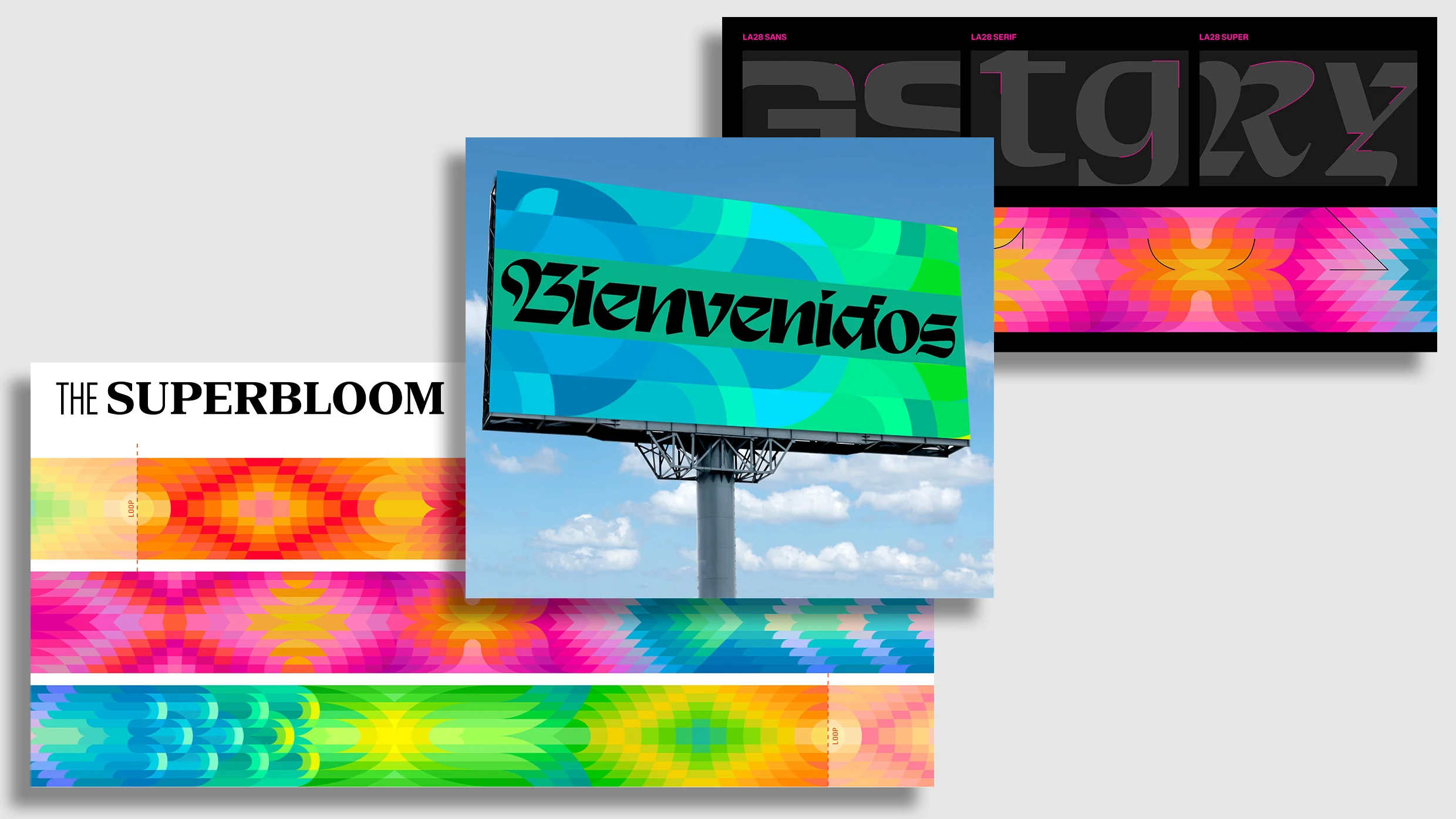
The LA28 design team has revealed the visual concepts for the 2028 Summer Olympics, drawing inspiration from the superbloom phenomenon in Southern California. This design approach incorporates bright, neon tones and abstract graphics that will influence everything from stadium decorations to promotional materials. Geoff Englehardt, head of brand and design, emphasizes the extensive application of this design across various elements, including printed graphics and sports equipment. A comprehensive guidebook has been created to ensure a cohesive visual identity throughout the games.
""The superbloom concept became a framework for this design language, providing a vibrant color scheme as well as the visual form of flower petals to guide the graphic treatment.""
""It'll take over miles of printed graphics, probably the same amount of digital screens, thousands of pieces of sport equipment from batons to hurdles to rugby balls.""
""To create a system that can work for all of that was quite challenging.""
Read at Fast Company
Unable to calculate read time
Collection
[
|
...
]