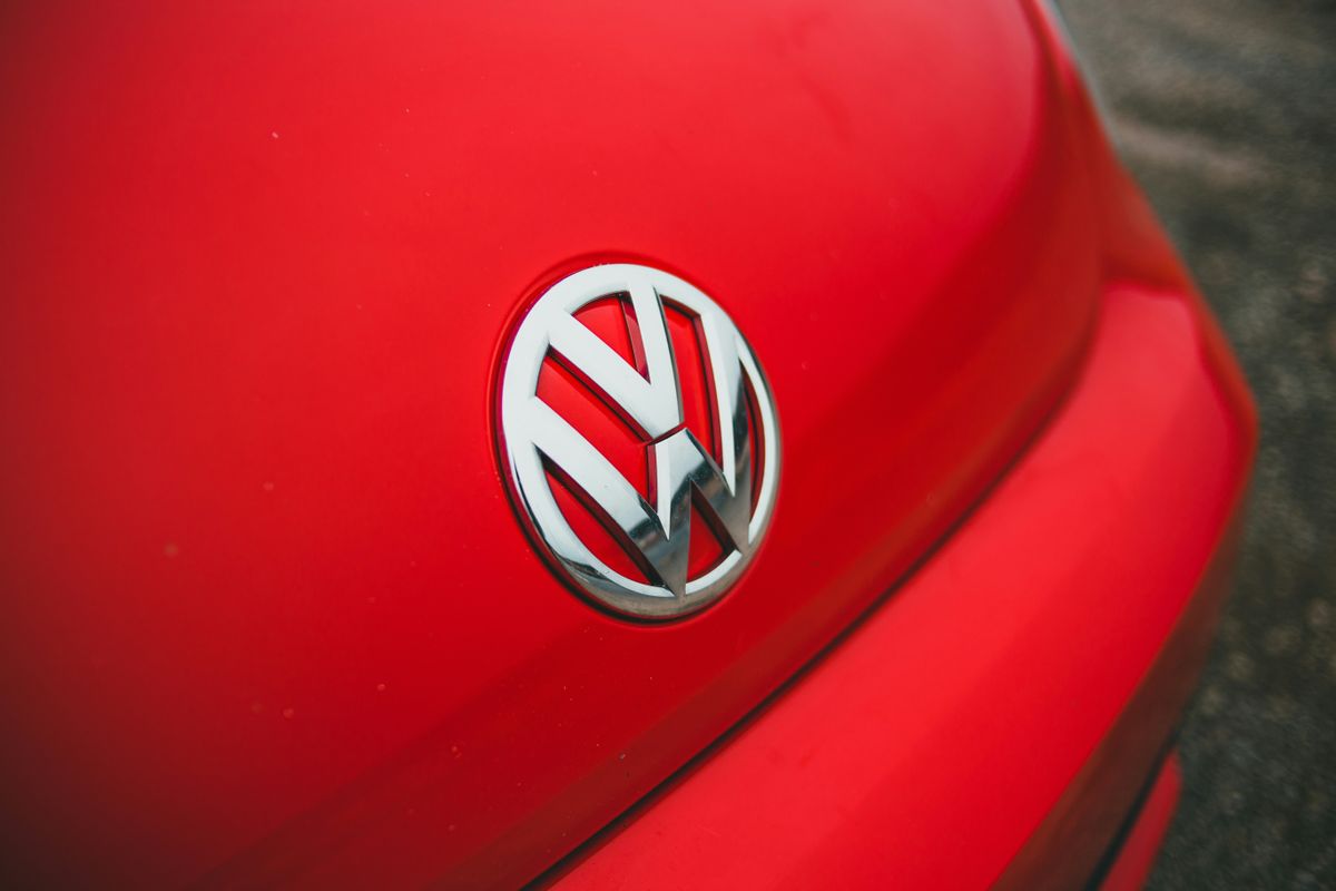
"There has been a heated debate among Volkswagen enthusiasts regarding whether a previous version of the VW logo featured the letters V and W joined without a gap."
"The Mandela effect is demonstrated in the public's conflicting recollections of the Volkswagen logo's design, leading some to believe they remember a connected emblem."
The Volkswagen logo, known for its simplicity and iconic shape, has sparked a debate over its historical design. While the current logo clearly separates the V and W within a circle, some individuals assert they remember a version where the letters were conjoined without a gap. This phenomenon, likened to the Mandela effect, reflects how collective memory sometimes misremembers logos and images. Some fans have even undertaken online research efforts to support their claims, hinting at a complex relationship between branding and public perception.
Read at Creative Bloq
Unable to calculate read time
Collection
[
|
...
]