"If you search for your city on a new map and zoom in, you can see pollution drifting from factories, power plants, and ports into your neighborhood. The map-a first-of-its-kind air quality tool from Climate TRACE, a nonprofit coalition cofounded by former Vice President Al Gore-shows how pollution moves through cities. The new interactive tool, launching September 24, is powered by a sophisticated model that tracks local air pollution and weather data and feeds the map."
""Eventually, we will have it on a daily basis, so that if you have a child with asthma or if you have family members with lung and heart conditions that make them sensitive to air pollution, you can go to your favorite weather app and see exactly what the pollution flows have been through your neighborhood that particular day," Gore says."
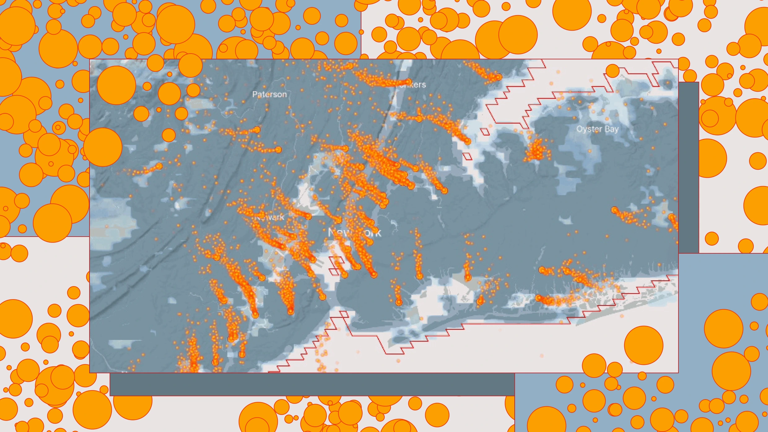
An interactive map by Climate TRACE visualizes PM2.5 pollution movement across more than 2,500 cities using local air pollution and weather models. The map shows orange dots for pollution sources and streams of smaller dots to display how emissions drift through neighborhoods with changing winds. It currently presents snapshots of average and bad air days and will move toward near-real-time daily data useful for people with respiratory or cardiovascular sensitivities. Researchers can analyze links between pollution and disease at neighborhood scales; policymakers and companies can use the visualizations to target regulations, transitions to cleaner technologies, and supply-chain improvements.
Read at Fast Company
Unable to calculate read time
Collection
[
|
...
]