"Big Cartel launched in 2005 as a low-cost, easily customisable ecommerce platform aimed at artists, powering over $2.5 billion in sales."
"The new identity leans unapologetically into the independent ethos, enhancing the brand's connection with its users through an energetic, scrappy look and feel."
"How & How focused on a visual and verbal overhaul, reasserting Big Cartel’s brand voice to resonate with the modern maker culture."
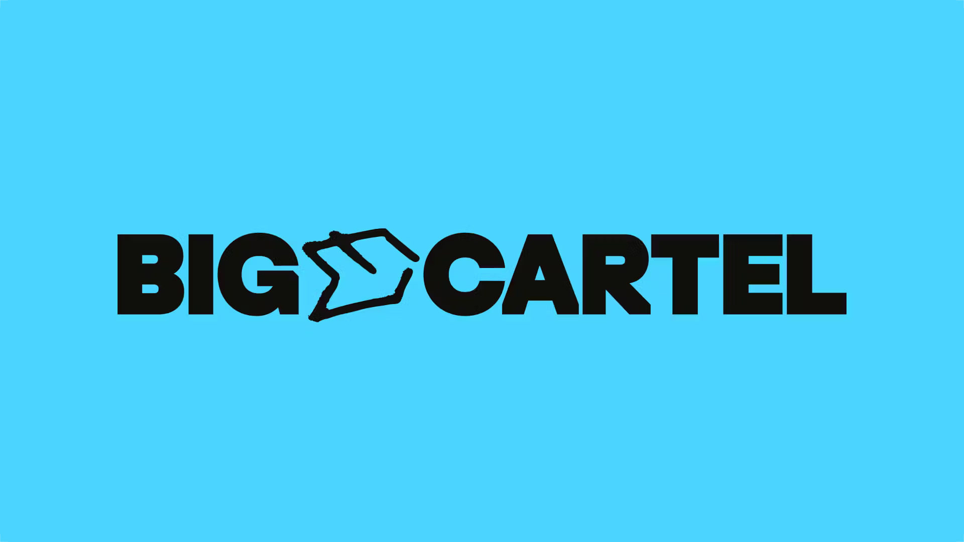
"The new wordmark uses ES Replan Variform, allowing for creative flexibility, while a hand-drawn glyph conceptually bridges structure and spontaneity."
Big Cartel, launched in 2005, is a customizable ecommerce platform for artists that has facilitated $2.5 billion in sales. Facing increased competition, it needed to redefine its brand identity. How & How was engaged to refresh the visual and verbal aspects while retaining a maker-first spirit. The updated identity embraces imperfection and energy, steering clear of corporate aesthetics. A new glyph between the words 'Big' and 'Cartel' introduces flexibility, paired with a customized wordmark that uses a distinct variable font, enhancing the brand's creative expression.
Read at Richard Baird
Unable to calculate read time
Collection
[
|
...
]