"Many of the best logos of all time feature ingenious hidden messages and double meanings. From the FedEx arrow to Toblerone's hidden bear, there are plenty of subtle yet delightful design touches out there. And another thing the best logos tend to have in common is that they're actually real. But every now and again, along comes a fan-made design so good that everybody thinks it's real - and when they find out it isn't, they wish it was."
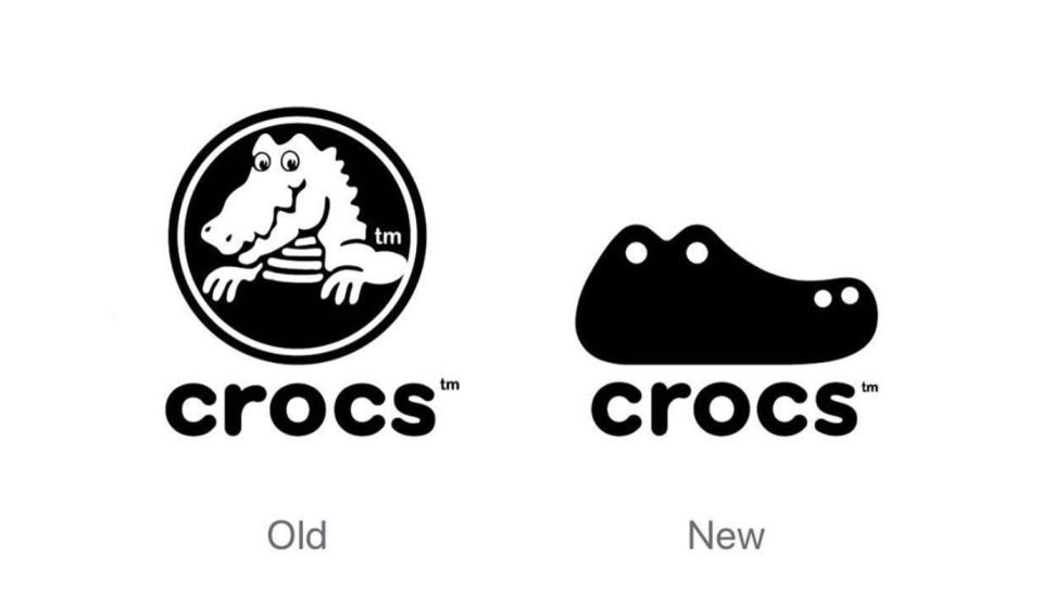
"In one of the simplest and most effective visual puns we've seen for a while, Kelleher riffs on both the iconic Crocs shape, and the head of a crocodile itself - simply by adding a couple of white dots to represent eyes and nostrils. It might be a much cleaner and more minimal design than the actual logo - an illustration of a crocodile - but it's somehow even more fun."
"In what feels like a bleak era of brand refreshes ( Kia, Jaguar, Cracker Barrel), credit where credit is due: the new Crocs logo is an instant classic," tweets Ben Springwater, seemingly thinking Kelleher's design is real. "Brilliant. If you had only shown me the new one, I would have sworn it was always their logo," one user comments, while another adds, "The most refreshing rebrand I've seen in ages."
Stephen Kelleher created a minimalist Crocs concept that transforms the shoe silhouette into a crocodile head by adding two white dots for eyes and nostrils. The design reads as a playful visual pun that simplifies and cleans up the brand's existing illustrated crocodile. The concept originally circulated in 2019 and resurfaced on social media, where many users praised it and assumed it was an official rebrand. Several comments called it an "instant classic" and a refreshing rebrand. The reception reflects Crocs' evolution from a utilitarian "ugly" shoe to a cultural and fashion-forward favourite.
Read at Creative Bloq
Unable to calculate read time
Collection
[
|
...
]