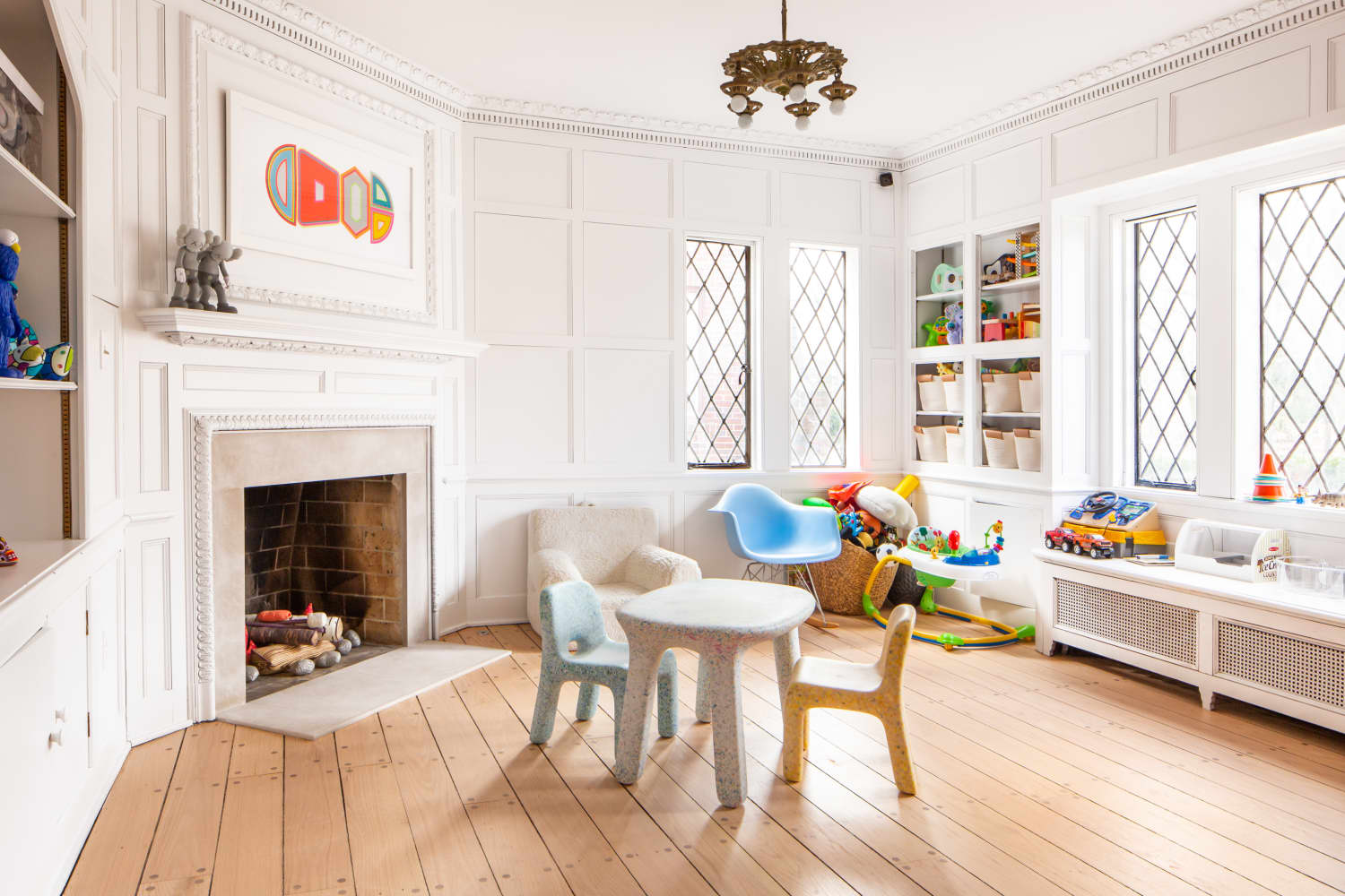
""The '80/20 color palette rule' is a design guideline that suggests using one color scheme for 80% of a room, and a contrasting color scheme for the other 20% to create balance and harmony.""
""If you love using warm colors like red, orange, cream, gold, and pink, then you should aim to balance those with accents of cool colors like blue, green, gray, cool whites, etc.""
""This light pink canvas offered the perfect opportunity to use the '80/20 rule' to create balance with the decor, using brushed brass and gold hardware to enhance the vintage vibe.""
""Despite my efforts at being a 'sad beige mom,' my daughter always gravitates toward the color pink, leading me to embrace this vibrant choice for decorating.""
The "80/20 color palette rule" is a design concept suggesting that 80% of a room's color should be one scheme while 20% should be contrasting. This balance creates harmony and can be applied using either singular colors or broader palettes. The author shares a personal account of utilizing this rule in her home office-turned-playroom makeover, focusing on pink as the primary color and incorporating brass and gold accents to enhance the vintage feel.
Read at Apartment Therapy
Unable to calculate read time
Collection
[
|
...
]