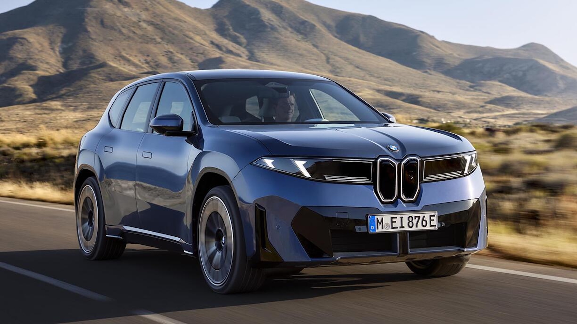
"Over the last few years it seems like every car brand under the sun has revealed a new logo. And they've mostly followed the same formula - flattening the existing design into a more digital friendly format whilst preserving the heritage of the original. Back in 2020, the trend was arguably kicked off by BMW, whose simplified redesign we called one of the best of the 2020s."
"While 2020's simplified logo has been appearing on the brand's advertising materials for half a decade now, it has been yet to make its way to the cars themselves. Instead, the emblem on vehicles was more decorative, featuring chrome borders around the ring, and grey dividing lines between the two colours of the inner logo (which is definitely not a propellor)."
"If anything, it's nice to see BMW adopt more consistency across its brand, with the discrepancies between its on-vehicle and digital logos scrubbed away. Indeed, we've seen plenty of examples of car brands unveiling new logos without quite having to put them on the bonnets themselves. That said, we'd rather the controversial new Range Rover logo sticks to the screen."
Automotive brands have broadly flattened and simplified logos to suit digital use while retaining heritage. BMW initiated a prominent redesign trend in 2020 with a simplified emblem used in advertising. On-vehicle badges, however, retained decorative chrome borders and internal dividing lines until now. The iX3 introduces the simplified emblem on the car itself, removing chrome layers and inner dividing lines to create a flatter badge. The change brings visual consistency between digital and physical branding across BMW models. Other manufacturers continue to sometimes limit new logos to screens rather than applying them to vehicle bonnets.
Read at Creative Bloq
Unable to calculate read time
Collection
[
|
...
]