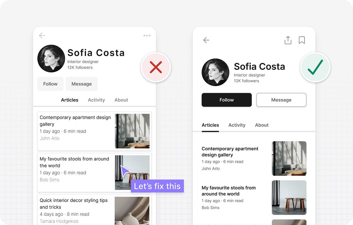
React
fromwww.jqueryscript.net
5 hours agoWeekly Web Design & Development News: Collective #654
New AI tools and web development resources are highlighted, including GPT-5.5 and various JavaScript and CSS libraries.
I'm heavily inspired by radical print design, particularly of the 70s after the birth of the Xerox, such as Shrew and OZ Magazine as well as protest banners and zines. I love the fast-paced, imperfect, tactile feeling and I try to emulate this through physically editing my work.
We've both fought against needless promotional content before and lamented that frontier AI platforms are falling into the same pattern. As designers and users, we've learned that "free" usually means putting up with interruptive, slightly creepy ads that feel more like a tax than a benefit - a frustration tax that now colors how we approach free‑tier services and now AI tools.
Static images don't show motion. You can't inspect real product structure. You don't see how interfaces evolve over time. You rarely understand what actually works in production. So I decided to go deep. I reviewed every major design reference platform I could find - not just the popular ones - and analyzed how they actually help in real-world work. The conclusion?
Designed by artists and designers from across the globe, each wallpaper comes in a variety of screen resolutions and can be downloaded for free. A huge thank-you to everyone who shared their designs with us - this post wouldn't be possible without your kind support!
I would listen with awe and think, 'That must have been a real challenge. It must be exquisitely crafted and probably a little bit groundbreaking too.' So it feels slightly absurd to admit that my last typeface, Nave, also took around ten years to complete. Not because I spent a decade polishing outlines or expanding the character set, but because I took so many wrong turns trying to chase a vision I hadn't properly defined.
The main problem with the existing homepage was that, besides the most recent posts, other content, once it aged and 'fell off' the front page, was then difficult to discover. The new design makes more use of available screen 'real estate', is visually much richer, and reorganizes 18 years of posts, so that even older long-forgotten posts are more easily found.
Teams often use customer and user interchangeably until it breaks alignment. Here's how separating the two clarifies research, prioritization, and messaging across B2C, B2B, and B2B2C products.