"It was important to us that it flowed seamlessly with the rest of the house and had a warmth that made people want to gather there. We also wanted to weave in a bit more vintage character so it felt true to the home's original charm."
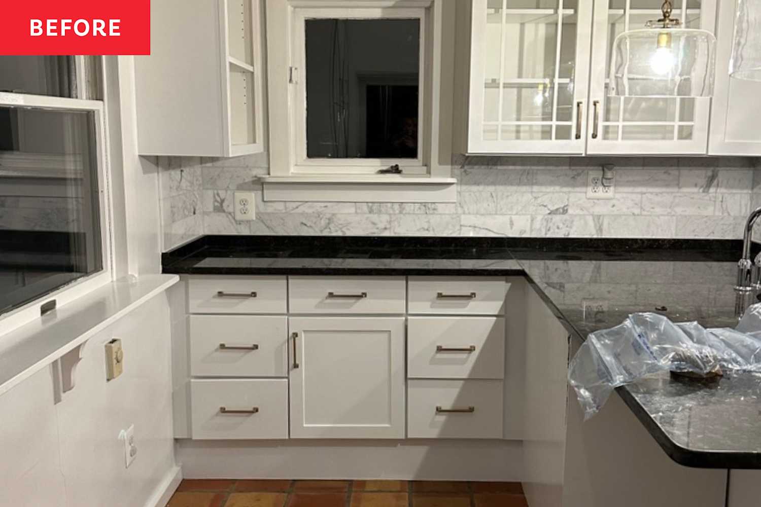
"A peninsula toward the back blocked the traffic flow, and there was no true eat-in space - just counter stools in the kitchen and a separate, adjoining dining room."
"My one non-negotiable was the color palette - I knew I wanted sage cabinets with brass accents. It feels warm, homey, and perfectly in tune with the character of the house."
The original kitchen sat at the back of a 1924 Sears kit home and hindered traffic flow with a blocking peninsula and no true eat-in area. The renovation aimed to make the kitchen the heart of the home, prioritizing seamless flow, abundant storage, warmth, and vintage character. The homeowners selected a sage-and-brass color palette to match the house’s cottage charm. Norton Interiors removed late 1990s/2000s cabinetry and black granite counters and reconfigured the layout to create an inviting, functional family gathering space that complements the home’s original character.
Read at Apartment Therapy
Unable to calculate read time
Collection
[
|
...
]