"But, if your heart is still set on painting your kitchen with a darker shade, we recommend using deep shades of cool colors such as green or blue, rather than the heavier and more drastic shades of black, gray, and brown. These cool colors are also quite pleasing and easy to contrast with pops of warm color in the kitchen, such as an orange rug or a red KitchenAid mixer on the counter."
"In the end, dark kitchens can still work out, granted you have a plan and a good budget. There are also many ways to make a dark kitchen feel brighter. Dark paint can also work beautifully if your kitchen space has a skylight, large windows where sunlight pours into, or strong, modern lighting to balance out the heaviness of dark paint."
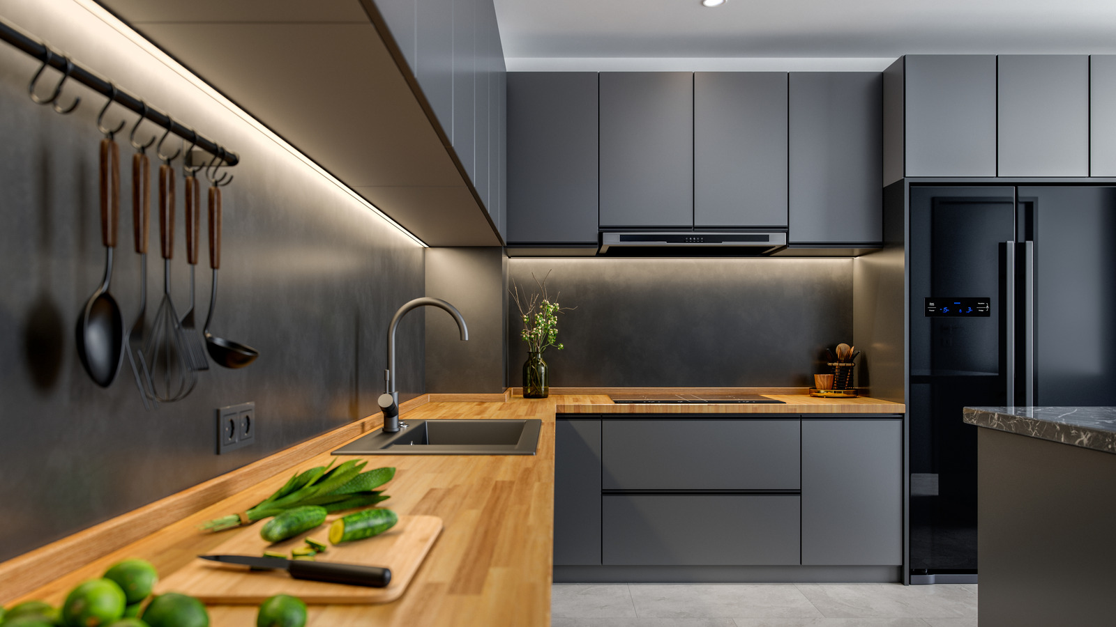
Kitchens painted in dark colors such as black, dark gray, or dark brown can absorb light and make the space feel gloomy and smaller. Dark paint works well only when paired with abundant natural light, skylights, large windows, or strong modern artificial lighting and a sufficient budget. Prefer deep shades of cool colors like green or blue over heavy blacks or browns if choosing dark hues, because they contrast well with warm accent pieces. Another strategy is to paint cabinets dark while keeping walls, countertops, and flooring light, such as crisp white or soft cream, to reflect light back into the space.
Read at Tasting Table
Unable to calculate read time
Collection
[
|
...
]