"I am using float, inline-block, setting font-size equal to 0, etc. In 2026, this may sound a bit hacky and outdated. Not really since this method works fine and is well supported, but can we do better using modern features? In five years, many things have changed and we can improve the above implementation and make it less hacky! Support is limited to Chrome only because this technique uses recently released features, including corner-shape, sibling-index(), and unit division."
"The CSS code is shorter and contains fewer magic numbers than the last time I approached this. You will also find some complex calculations that we will dissect together. Before diving into this new demo, I highly recommend reading my previous article first. It's not mandatory, but it allows you to compare both methods and realize how much (and rapidly) CSS has evolved in the last five years by introducing new features that make one-difficult things like this easier."
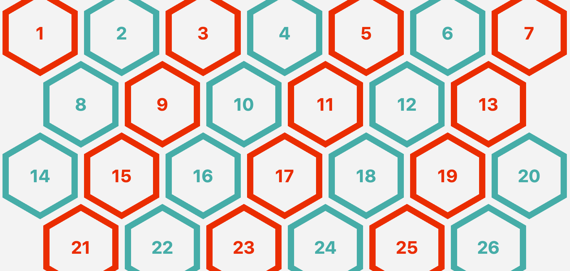
"Previously, I had to rely on clip-path: polygon() to create it: .hexagon { --s: 100px; width: var(--s); height: calc(var(--s) * 1.1547); clip-path: polygon(0% 25%, 0% 75%, 50% 100%, 100% 75%, 100% 25%, 50% 0%); } But now, we can rely on the new corner-shape property which works alongside the border-radius property: .hexagon { width: 100px; aspect-ratio: cos(30deg); border-radius: 50% / 25%; corner-shape: bevel; }"
Modern CSS features such as corner-shape, sibling-index(), and unit division enable a responsive hexagon grid without media queries or JavaScript. The technique supports any number of items and uses CSS variables to control size and gap, removing previous reliance on floats, inline-blocks, or font-size hacks. The CSS is shorter and contains fewer magic numbers, while complex calculations handle layout and aspect ratios more cleanly than clip-path polygons. The corner-shape property combined with border-radius simplifies hexagon creation and allows borders without workarounds. Browser support is currently limited to Chrome due to recent feature additions.
Read at CSS-Tricks
Unable to calculate read time
Collection
[
|
...
]