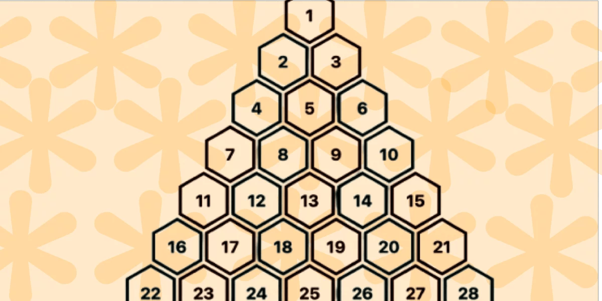
"Support is limited to Chrome only because this technique uses recently released features, including corner-shape, sibling-index(), and unit division. In this article, we will explore another type of grid: a pyramidal one. We are still working with hexagon shapes, but a different organization of the elements. A demo worth a thousand words: For better visualization, open the full-page view of the demo to see the pyramidal structure. On screen resize, you get a responsive behavior where the bottom part starts to behave similarly to the grid we created in the previous article!"
"This time, we will rely on CSS Grid instead of Flexbox. With this structure, it's easy to control the placement of items inside columns and rows rather than adjusting margins. .container { --s: 40px; /* size */ --g: 5px; /* gap */ display: grid; grid-template-columns: repeat(auto-fit, var(--s) var(--s)); justify-content: center; gap: var(--g); } .container > * { grid-column-end: span 2; aspect-ratio: cos(30deg); border-radius: 50% / 25%; corner-shape: bevel; margin-bottom: calc((2*var(--s) + var(--g))/(-4*cos(30deg))); }"
A pyramidal layout of hexagon tiles is achieved using modern CSS features that are currently supported only in Chrome, such as corner-shape, sibling-index(), and unit division. The layout uses CSS Grid with repeat(auto-fit, var(--s) var(--s)) and centered justification to create responsive columns. Each tile spans two grid columns, uses an aspect-ratio based on cos(30deg), tailored border-radius, corner-shape: bevel, and a negative margin-bottom calculation to stack shapes into a pyramidal arrangement. The result is a responsive structure that adapts without media queries or JavaScript and refines a five-year-old approach while reusing prior shape formulas.
Read at CSS-Tricks
Unable to calculate read time
Collection
[
|
...
]