"Using grid lines is a flexible and powerful way to place your elements on a grid, but, when looking at the code, it might be a bit hard to visualize. So Grid gives you another way to place your elements that might be easier to see called grid areas. There's a bit more upfront work involved, but the pay off might be worth it."
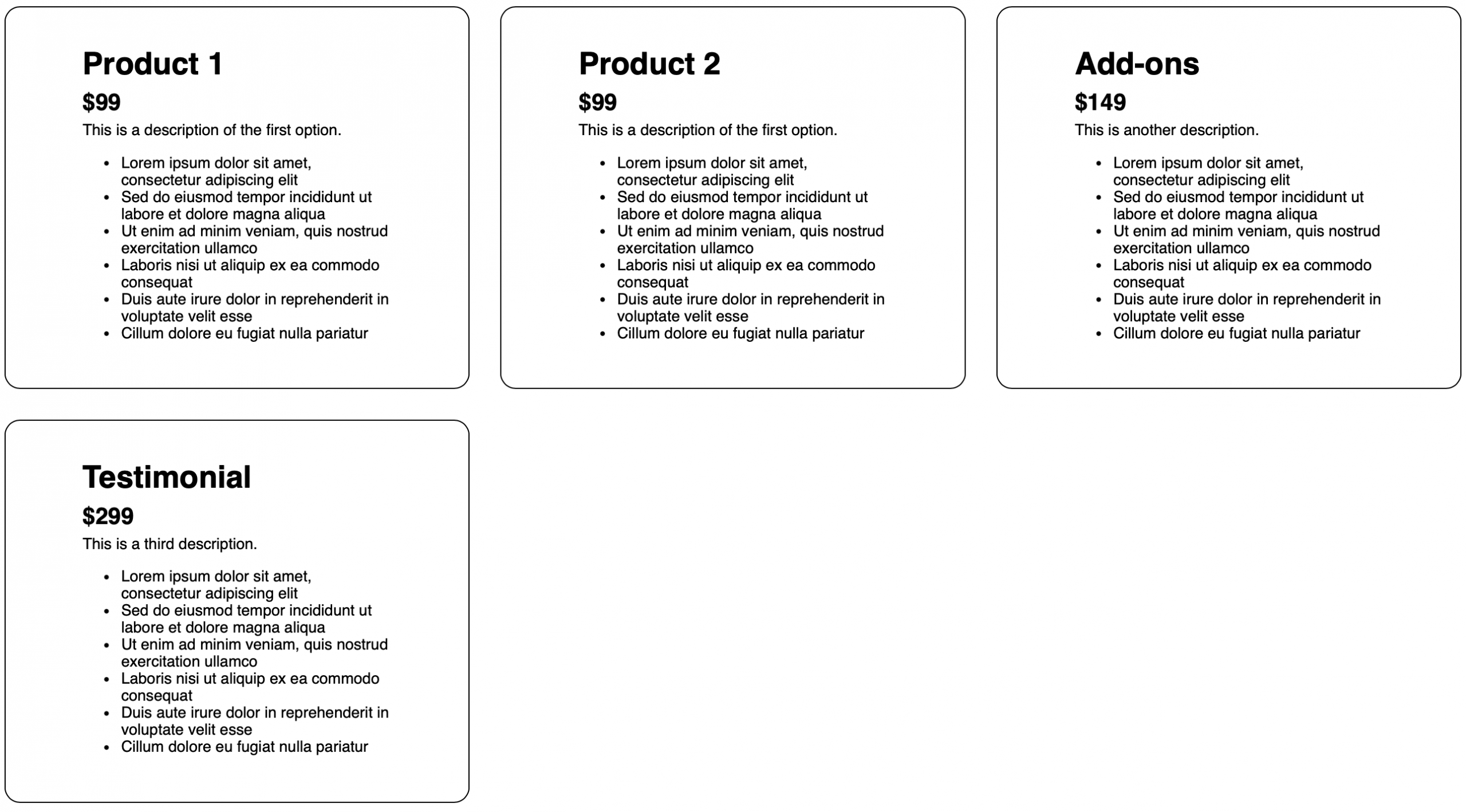
"My grid is three columns across and an unspecified number of rows, which means it'll be as many rows as needed. I'm going to assign product-1 to that first top cell and product-2 in my second top cell. Then my third top cell is going to be taken up by my add-ons element. And because my add-ons element is going to span two rows, the cell right beneath that is going to be assigned to add-ons too."
Grid areas require naming each grid item via the grid-area property and assigning those names to cells with grid-template-areas. Matching class names to grid-area names improves clarity and makes CSS easier to read. Each quoted string line in grid-template-areas represents a row and places named identifiers into grid cells; repeating a name across cells creates spanning across rows or columns. In a three-column example, product-1 and product-2 occupy top-left and top-center, add-ons occupies the top-right and the cell beneath to span two rows, and testimonial occupies two adjacent bottom cells to span two columns. The approach needs slightly more setup but yields clearer visual placement.
Read at WebKit
Unable to calculate read time
Collection
[
|
...
]