A YouTube link redirected through an intermediary, creating a man-in-the-middle scenario where the platform intercepted an outbound link. The interface placed emphasis and order on call-to-action buttons that nudged the user toward the platform's preferred action. The primary/secondary control pattern has inverted over time: classic software prioritized what was best for the user and offered alternatives as secondary, while modern software prioritizes what is best for the platform and offers acceptable alternatives as secondary. The result is interfaces increasingly designed to serve platform interests rather than the user's intentions.
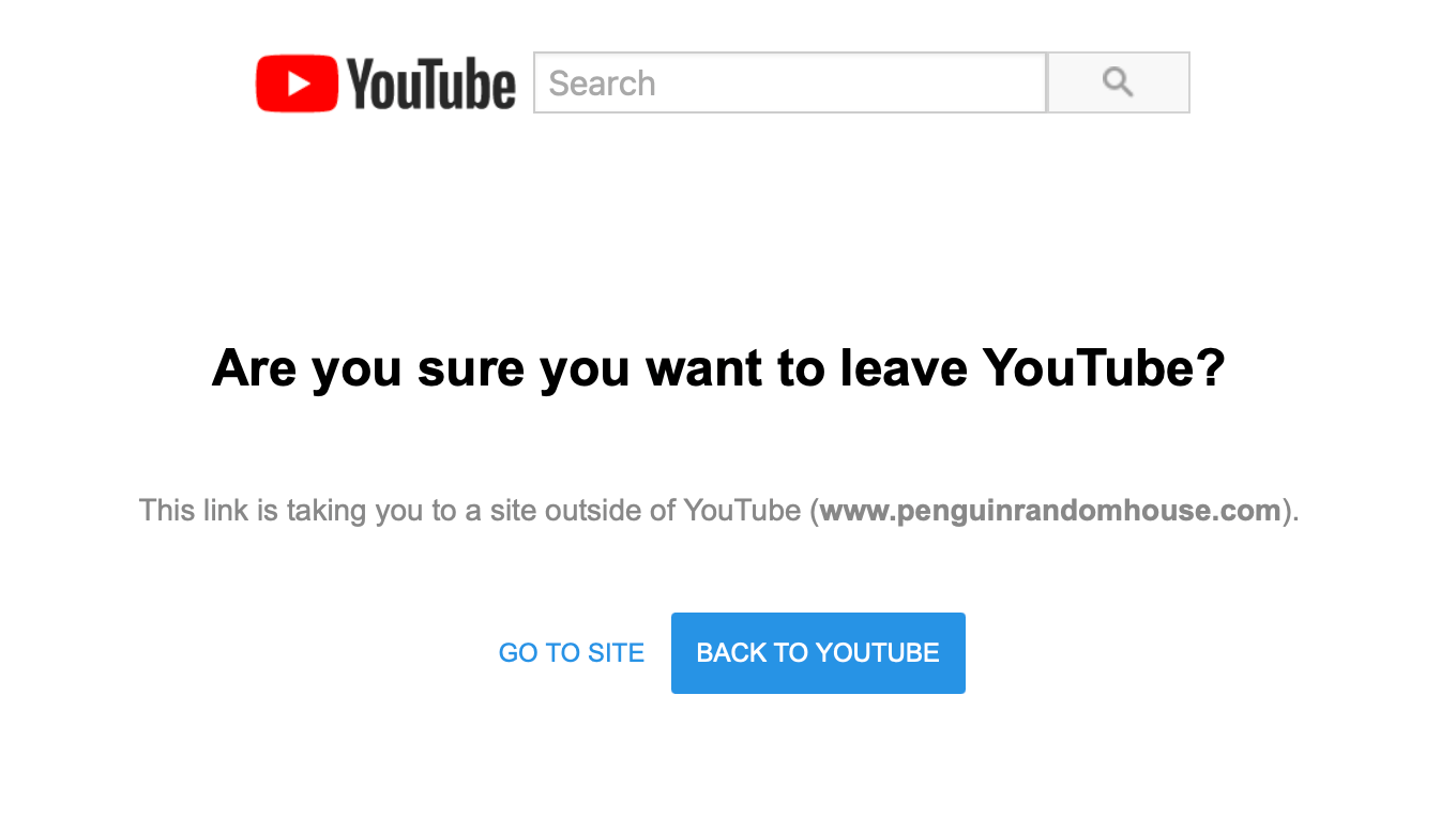
"The other day I was browsing YouTube - as one does - and I clicked a link in the video description to a book. I was then subjected to a man-in-the-middle attack, where YouTube put themselves in the middle of me and the link I had clicked: Hyperlinks are subversive. Big Tech must protect themselves and their interests."
"Look how the design pattern for primary/secondary user interface controls has inverted over time: Classic software: Primary CTA: what's best for you Secondary CTA: an alternative for you Modern software: Primary CTA: what's best for us Secondary CTA: what's acceptable to us"
"What struck me was the ordering and visual emphasis of the "call to action" (CTA) buttons. I almost clicked "Back to YouTube", which was precisely the action I didn't want."
Read at Jim-nielsen
Unable to calculate read time
Collection
[
|
...
]