"News outlets have emphasized the first 100 days of new administrations by showcasing various metrics and events, providing visual data for clearer insights."
"Different outlets have utilized distinct methods like timelines, charts, and photos, each aiming to capture the administration's impact on the economy and approval ratings."
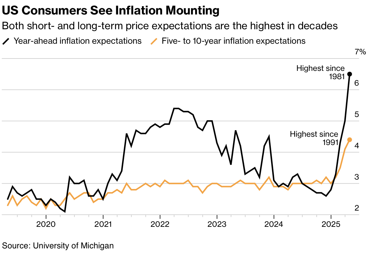
The article discusses how news outlets highlight the first 100 days of a new administration, showcasing various metrics and visual data to provide insight into the changes. Bloomberg charted the economy using several metrics, Axios utilized a color-coded timeline, while the New York Times featured eight charts focusing on approval ratings. The Washington Post and Financial Times each presented ten charts to illustrate changes, with Reuters opting for a photographic approach. The diversity in data representation highlights the administration's impact on the economy and public perception.
Read at FlowingData
Unable to calculate read time
Collection
[
|
...
]