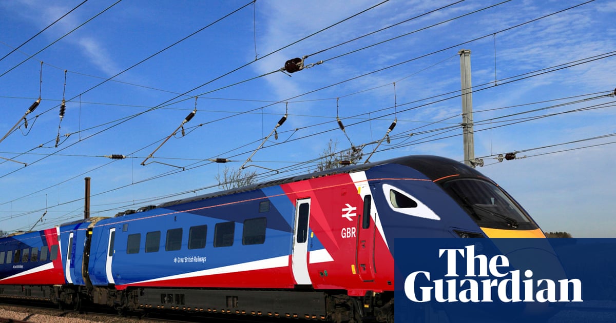
Great British Railways brand and livery will be unveiled at London Bridge, featuring red, white and blue. The DfT designed the logo in-house, using rail typeface for the GBR name and incorporating the double arrow as a nod to Britain's railway heritage rather than a direct copy of British Rail. Physical train repaints could begin next spring. The new branding will appear on a Hornby model, in Train Sim World 6, and on displays at major stations. Legislation to nationalise and reform the railway is being debated in the House of Commons to create a unified, accountable nationalised system. Fares have been frozen.
"The logo, branding and livery for the impending renationalised and reformed railway will be unveiled by ministers at London Bridge on Tuesday. It is red, white and, yes, blue. The Department for Transport said passengers will get their first look at the future of Britain's railways a future that may ring a few bells. Designed in-house at the DfT, the logo is the GBR name in rail typeface accompanied by the double arrow symbol"
"The future of Britain's railways begins today. I'm immensely proud to unveil the new look for Great British Railways as we deliver landmark legislation to nationalise our trains and reform the railway so it better serves passengers. This isn't just a paint job it represents a new railway, casting off the frustrations of the past and focused entirely on delivering a proper public service for passengers."
Read at www.theguardian.com
Unable to calculate read time
Collection
[
|
...
]