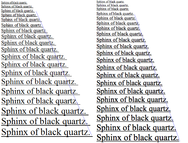
"Text rendering on macOS and Windows reflects two contrasting philosophies. Apple prioritizes aesthetic fidelity; Microsoft focuses on sharpness and readability."
"Mac's approach preserves the shape and weight of the typeface, making text appear thicker and smoother, whereas Windows renders text crisper but thinner."
The article explores the different philosophies behind text rendering on macOS and Windows. Apple aims for aesthetic fidelity in font presentation, intending to mimic print quality closely, resulting in smoother and more visually appealing text. In contrast, Microsoft emphasizes on-screen readability, crafting text to be sharp and crisp, even if this means altering the original design. This divergence in rendering techniques explains why users may perceive text on a Mac as thicker and softer, while Windows text appears thinner yet clearer.
Read at Medium
Unable to calculate read time
Collection
[
|
...
]