"The joy of font design is that there are (arguably) no wrong answers - the existence of wingdings is enough to prove my point."
"While current typography trends are leaning towards minimalism and kinetic design, fear not, some type designers are still embracing a more out-of-the-box approach."
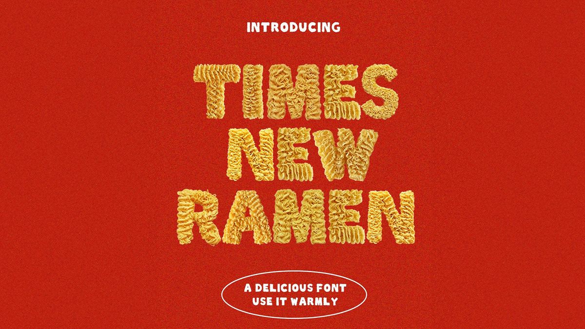
"Using real ramen photography and Photoshop editing, Seine shaped the noodles into individual letters which are 'perfect for menus, packaging, and more.'"
"It's perhaps not the best choice for accessible web fonts or a professional portfolio, but the playful appeal of Times New Ramen makes it perfect for foodies and font fans alike."
Seine Kongruangkit's innovative font, Times New Ramen, made from ramen noodles, illustrates the creative potential in typography. While minimalistic designs dominate the current trends, Kongruangkit embraces a whimsical concept that appeals to food enthusiasts. Drawing inspiration from traditional ramen packaging, she used photography and Photoshop to craft letters from noodles. Although it might not suit professional projects, the font offers a unique charm for menus and packaging. It highlights the ongoing exploration in font design, leaving room for more food-themed typography creations to emerge.
Read at Creative Bloq
Unable to calculate read time
Collection
[
|
...
]