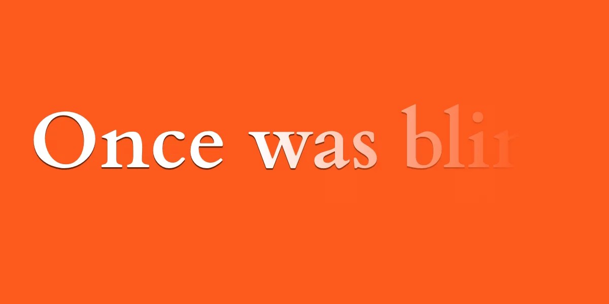
CSS cannot directly target individual characters, but letter-spacing can simulate character-level control. Letter-spacing changes the spacing between all glyphs in a text block using length units or percentages relative to font size. Negative values shrink glyph boxes, causing overlap and even shifting direction. The property is animatable, so text can start fully overlapped with transparent color and then reveal by animating letter-spacing to zero or a positive value while changing color to visible. Alignment rules like text-align center or right determine where overlapped glyphs bundle. Transitions can coordinate letter-spacing and color changes for a smooth reveal effect.
"Some text effects are relatively hard to pull in CSS, the main reason being we are unable to target individual characters (something many of us want in the form of ::nth-letter(), although we have basis for it with ::first-letter that gives us access to a box element's first glyph. But maybe there are a few things we can use today with what we already have."
"The CSS letter-spacing property adjusts the space between all characters in a block of text. Positive values add space to the right side of each glyph (in a left-to-right writing mode), and negative values shrink the width of the glyph box, causing letters to overlap and even move the other way. The letter-spacing accepts length units, and percentage (relative to font size). It is animateable, and as we saw before, the negative values can shrink it down or reverse it."
"Overlapping and separating letters It's quite easy to completely overlap the characters as a starting point and setting it's color to transparent to visually hide it. label { letter-spacing: -1ch; color: transparent; /* etc. */ } From there, we can reveal the text by animating that letter-spacing value to a positive value and updating the color to a visible value, like when a checkbox is :checked:"
"li:nth-of-type(2) label { text-align: center; } li:nth-of-type(3) label { text-align: right; } input:checked + label { letter-spacing: 0ch; color: black; transition: letter-spacing 0.6s, color 0.4s; } Note: The CSS ch unit is a relative length representing the width of the zero (0) glyph. The labels go from negative letter-spacing to normal spacing and the color updates to black. Both these changes happen over a transition."
Read at CSS-Tricks
Unable to calculate read time
Collection
[
|
...
]