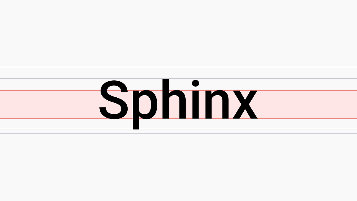
"The x-height of a typeface significantly influences legibility, particularly on screens, with higher x-heights aiding readability in small text sizes."
"Visual arc is crucial in typography as it relates to how easily text can be perceived based on distance, implying that the design must consider viewer proximity."
"Typeface choice should balance font metrics such as spatial efficiency and multi-language support to ensure optimal user experience across different devices and languages."
The article discusses key UI font metrics, focusing on x-height ratio and visual arc, to aid in selecting suitable typefaces for products, particularly for mobile devices. It emphasizes that higher x-heights improve legibility at smaller sizes, which is essential for digital interfaces. The piece also explores the relationship between visual arc and readability, providing insights into the optimal x-height for fast reading. Tools like the x-height Readability Calculator can support designers in this process, ensuring that text remains readable across different viewing distances.
Read at Medium
Unable to calculate read time
Collection
[
|
...
]