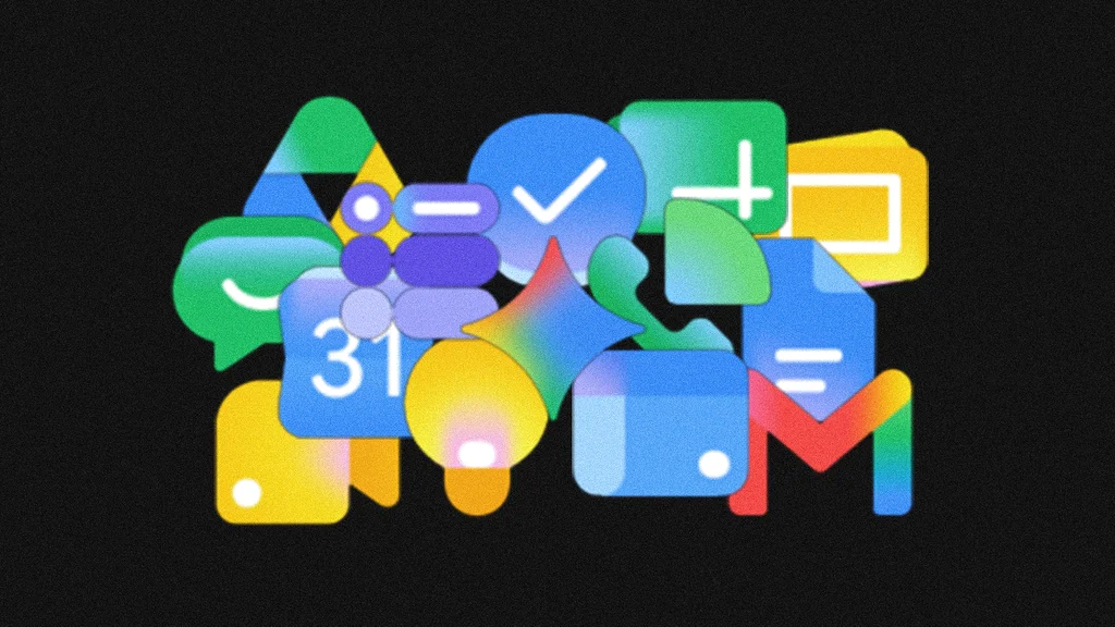
Google is rolling out redesigned logos for Workspace apps such as Gmail, Google Docs, and Google Drive. The new icons appear softer and rounder, with a watercolor-like look. A key change is the addition of color gradients across the suite. Gmail transitions through Google’s brand palette, including green. Google Meet and Google Chat use more limited yellow-and-green aura schemes. Google Docs shifts from a flat blue to a blend of blue and purple. The update began appearing May 18 across web, Android, and iOS. This is the first Workspace icon refresh since 2020 and aligns with a broader move toward gradients as a defining AI-era visual style. Designers have also adopted recognizable AI-themed shapes such as circles, sparkles, and swirling voids to represent AI’s intangible nature.
"Google is quietly rolling out a redesign of the logos for its Workspace apps, including Gmail, Google Docs, and Google Drive. They now look like they've been run through a watercolor filter. Each new logo in the suite-which began showing up on May 18 on the web, Android, and iOS-is softer and rounder than its predecessor. What really stands out, though: Every single icon has been given some sort of color gradient."
"Gmail now smoothly transitions through Google's brand palette of primary colors and green; Google Meet and Google Chat have lost the full palette in favor of yellow and green aura schemes, respectively; and Google Docs has gone from a flat blue to a subtle fusion of blue and purple. This is the first time Google has updated its Workspace icons since 2020, and it's a clear effort to visually denote its shift into the AI era."
"According to Ben Sherwood, creative partner at the agency Design Bridge and Partners, we're currently witnessing a collective pivot from the "stark simplicity of flat design" toward "what could be termed the 'AI gradient everywhere' aesthetic." Buttholes, voids, and sparkles Since ChatGPT debuted in 2022, designers have faced the novel challenge of figuring out how to visually represent a technology as powerful and amorphous as AI in a way that sparks curiosity rather than skepticism."
"Several distinct logo shapes have already solidified themselves as hallmarks of the early AI transition-some almost to the point of parody. There are the plain circles used by Meta and Grok; the twinkling sparkle that appears on Google's Gemini chatbot, Adobe Photoshop's generative image filler, Grammarly's language fixer, and Wix's auto website maker; and the swirling, nebulous void used by OpenAI, Anthropic, and Perplexity (sometimes called the " AI butthole ")."
Read at Fast Company
Unable to calculate read time
Collection
[
|
...
]