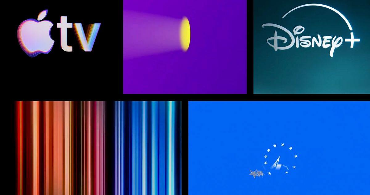
"The streaming services have duked it out on several fronts over the years - battling to put out countless movies and TV shows, grow subscribers domestically and internationally, gain live sports and television, and deliver ad-supported tiers to customers. But these streamers are just as defined by how often they reinvent themselves, as with the rebranding of HBO Max a.k.a. Max a.k.a. HBO Max and Apple TV's recent choice to drop the plus."
"Savannah: You're right. Even the Empire had a flair for design, but Prime absolutely does not. No style, no flavor, just a whole lot of blue and a forgettable jingle. I suppose that's on brand for Prime, though it does no justice to their pretty good originals. Nick: Yeah, it's truly damned by the power of its forebear. The rainbow-chicken chime is really one of those jingles that's going to endure even if the world ends in nuclear fallout."
Streaming services compete on content, subscribers, live sports, and ad-supported tiers while frequently reinventing branding through rebrands and logo animations. Apple launched a new logo animation with a mnemonic composed by Finneas, who said the short piece of music matches things he loves about Apple. Signature sounds and idents prompt questions about recall, preference, and effectiveness. Ident bumpers vary from forgettable jingles to dramatic or indelible cues. Prime's ident lacks style and feels generic; Peacock's chime leans cartoonish; Paramount+ adds a jazzier riff for drama; HBO Max's recent bumper feels sleepy with multi-beat tapping atop a slow sonic swell.
Read at Vulture
Unable to calculate read time
Collection
[
|
...
]