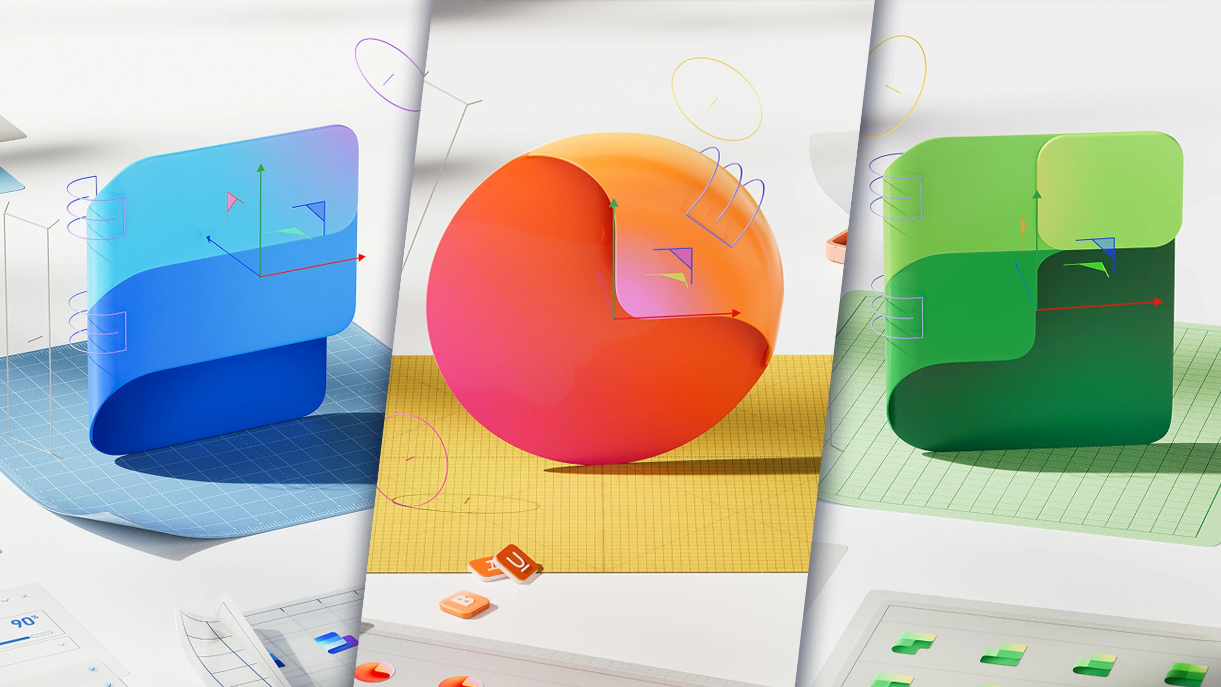
"Microsoft just redesigned all of its Office icons to embrace the AI era, and, according to the company, that means ditching solid shapes for all things "fluid and vibrant." The 12 new icons, which began rolling out on October 1, encompass all of Microsoft's platforms from Outlook to Word Documents and Teams. This is the first time that Microsoft has updated the icons' aesthetics in seven years, and the company's designers have reworked every logo to be curvier, brighter, and more colorful."
""Today, as we roll out refreshed icons for Microsoft 365 apps, small but significant design changes are a reflection and a signal," a Microsoft blog post, published on October 1, reads. "As a reflection, they encapsulate how AI is shifting the discipline of design and the nature of product development." Microsoft's new icons are reflective of a broader trend in the tech world. Now that AI is ushering in the next major era of the industry, its biggest players are trying to figure out exactly how these expanded capabilities should be reflected in their branding. So far, one trend is clear: AI is becoming visually synonymous with a colorful gradient."
Microsoft redesigned all 12 Office icons to reflect the AI era, replacing solid shapes with curvier, brighter, and more colorful designs. The new icons began rolling out on October 1 across Outlook, Word Documents, Teams, and other Microsoft 365 platforms. The update is the first aesthetic change in seven years and involved reworking every logo to be more fluid and vibrant. The redesign departs from the 2010s 'blanding' trend of ultra-flat, minimal logos that prioritized cross-device simplicity. Microsoft positions the changes as evidence that AI is reshaping design practice and product development, aligning with an industry trend toward colorful gradients to signify AI.
Read at Fast Company
Unable to calculate read time
Collection
[
|
...
]