"When it comes to political branding, concerns about the potential misuse of the identity aren't necessarily as paramount as they are with commercial brands."
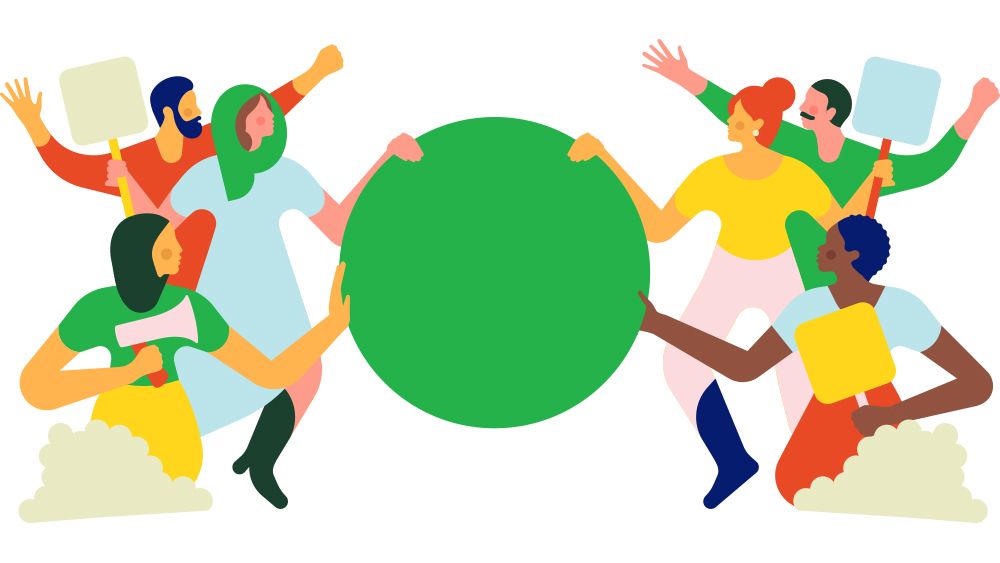
"The great thing about this logo is that it is easily reproducible... It is also an emoji, quite frankly,"
"We want this logo to be representative. But also, we want people to feel some ownership towards it."
"A simple emoji provides an easy way for people to express and share their support for the party in a digital era."
The Green Party of Canada recently unveiled a radically simple new logo, opting for a generic emoji. This decision, made shortly before a potential federal election, seeks to capitalize on the emblem's familiarity and reproducibility in digital communication. The party believes this approach, while unconventional, strengthens their brand by allowing grassroots supporters to easily adopt and share the logo. Co-leader Jonathan Pedneault emphasized that ownership and representation are crucial for the party's identity, encouraging a connection with voters through a logo that transcends traditional branding concerns.
Read at Creative Bloq
Unable to calculate read time
Collection
[
|
...
]