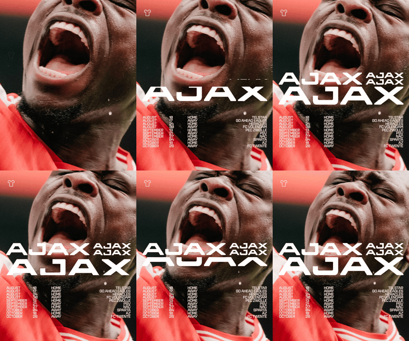
"Rather than seeing the necessary inclusion of this classic design as a limitation, Smörgåsbord looked to the logo as a catalyst for an entirely new design system altogether - one that would be flexible enough to stretch from the field to the screen and be impactful enough to support the original mark. Starting with a new custom typeface that spoke to Ajax's heritage, whilst bringing the club into the contemporary, the studio began to rigorously redraw the typography associated with the former logo."
"This process slowly turned into the development of a bespoke new font family for the football club in collaboration with Cotype Foundry that ended up with a total of 15 weights and cuts. "This offered us both versatility and consistency across all Ajax communications", Dylan says, "from broadcast graphics and in-stadium screens to wayfinding and hospitality spaces, the system adapts seamlessly to every context.""
Smörgåsbord reframed Ajax's classic logo as the seed for a new, flexible design system spanning field and screen. The studio developed a custom typeface that references Ajax's heritage while modernizing letterforms, rigorously redrawing typography and partnering with Cotype Foundry to produce a 15-weight family. The typeface delivers versatility and consistency across broadcast graphics, in-stadium screens, wayfinding, and hospitality. The approach favored an editorial, refined aesthetic over the typical bold italicised sans-serif sports style, introducing vertical cuts and off-kilter characters and drawing visual influence from the 1900s through the 1960s and 1970s to merge past and present iconography.
Read at Itsnicethat
Unable to calculate read time
Collection
[
|
...
]