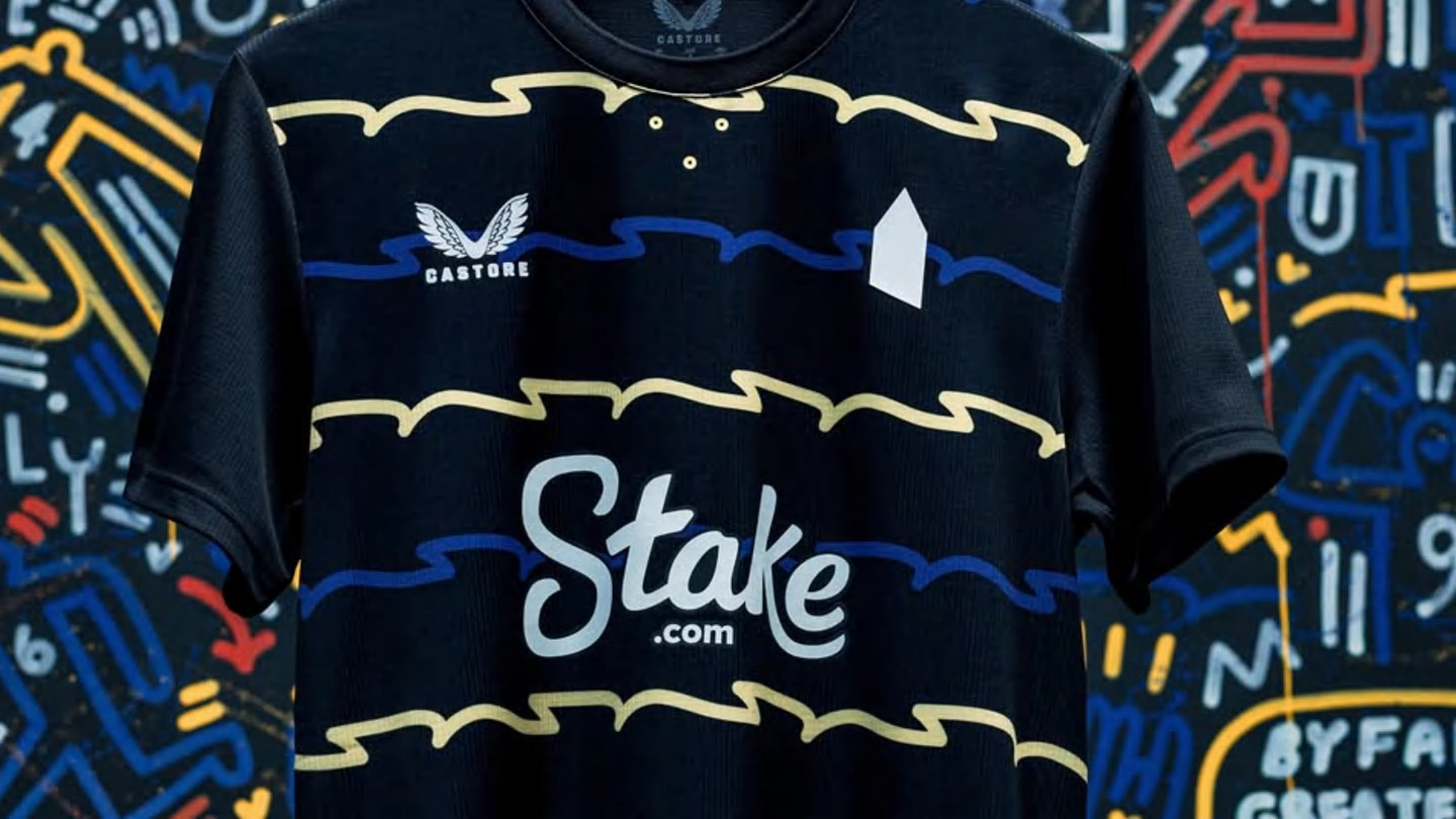
"Designed by Castore, the kit reimagines the ripples of the River Mersey in a bold, colourful design inspired by local graphic artist Neil Keating. The black shirt, featuring a crew-neck collar, incorporates an abstract blue-and-yellow pattern across the body, mimicking the flow of the river past Everton's new stadium. The look is completed with black shorts and matching socks, featuring blue-and-yellow stripes on the fold-over."
"But the real talking point is what's missing. The third kit features no traditional club crest. Instead, the shirt bears a simple white pentagon on the chest, symbolising Prince Rupert's Tower the historic village lock-up that has long been part of Everton's badge. While some supporters praised the design as bold and forward-thinking, others slammed the absence of the crest, saying it strips away part of the club's identity."
Everton's 2025/26 third kit, designed by Castore and inspired by local graphic artist Neil Keating, reimagines the ripples of the River Mersey in a bold, colourful pattern. The black crew-neck shirt features an abstract blue-and-yellow design across the body, paired with black shorts and matching socks that include blue-and-yellow stripes on the fold-over. The shirt omits the traditional club crest and instead displays a simple white pentagon symbolising Prince Rupert's Tower, the historic village lock-up associated with Everton's badge. Supporters are divided, with some praising the daring design and others criticising the removal of the crest. Visibility on pitch and team results may shape its legacy.
Read at www.90min.com
Unable to calculate read time
Collection
[
|
...
]