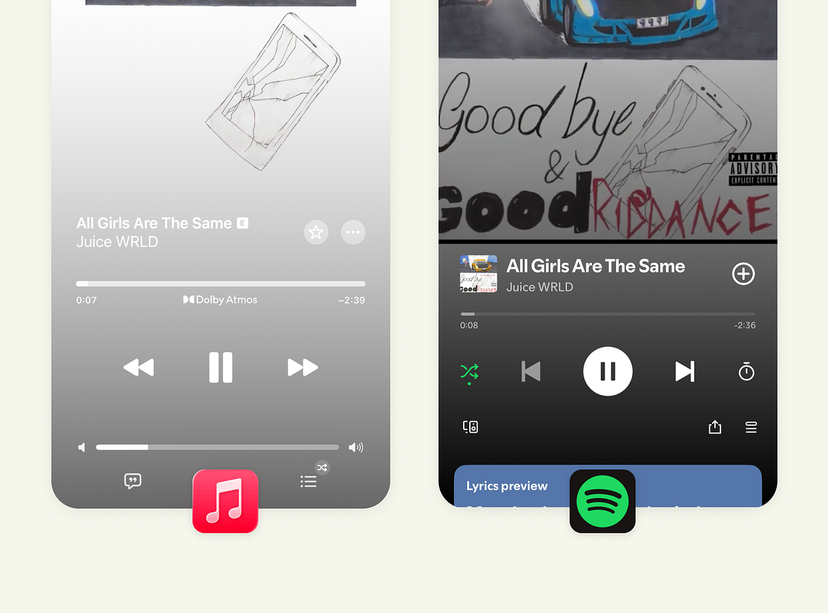
Apple Music favors a calm, minimalist player screen that prioritizes visual serenity and large expressive typography for immersion. The minimal approach can create ambiguous controls, such as similar-looking volume and track sliders, and may include redundant elements compared to physical volume buttons. Spotify favors a structured, higher-contrast interface that surfaces controls, states, and feedback more clearly, trading visual minimalism for usability and control. For lyrics, Apple highlights the current line for cinematic focus, while Spotify shows more lines to support follow-along and social singing. Apple centralizes the queue on the same screen to allow direct management of upcoming tracks.
"Apple Music takes a calm, minimalist route. The interface feels almost meditative, spacious, centered, and distraction-free. But that visual stillness has trade-offs. The volume and track sliders look nearly identical, which could confuse new users. And given that most people adjust volume with physical buttons, that second slider arguably adds clutter. Spotify, in contrast, embraces structure. You see controls, states, and feedback clearly. The higher contrast gives each element its own weight, especially in dark mode."
"Apple's lyric experience feels cinematic. Only the current line is highlighted, and the rest fades away softly. The typography is large and expressive, guiding attention exactly where it should be. It's less about singing along and more about immersion. Spotify's lyric UI is more inclusive; it shows more lines at once so users can follow, anticipate, and join in. The trade-off? Slightly reduced focus. The smaller type and dense layout work for engagement but not necessarily for deep reading."
Read at Medium
Unable to calculate read time
Collection
[
|
...
]