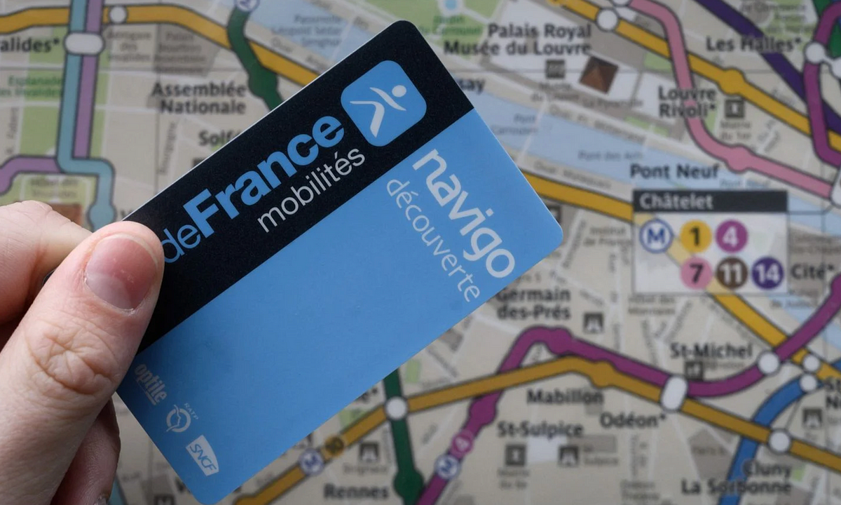
"The app told you it was complete too early - before the transfer actually finished. We kept removing the card before the ticket was saved. A really annoying experience."
"Only once you've failed does it become clear. This entire experience left us frustrated. We were penalized not because we refused to pay, but because we misunderstood a poorly designed system."
"We talk a lot about user error as if it's just a matter of being careless. But when millions of people use a service for the first time and regularly make the same mistakes, that's a design problem."
"If the interface isn't clear, assumes prior knowledge, or silently allows you to do the wrong thing, then it's not 'just bad UX' - it's a trap with consequences."
Frustration arises from poorly designed systems that mislead users into making mistakes. Initially, the app informed users too early that a ticket loading was complete, causing user error. Users were penalized by fines not for fraud but for misunderstanding the unclear interface. As millions interact with services for the first time and make similar errors, responsibility lies in design rather than user negligence. Escaping blame requires recognizing the design flaws that create traps with real consequences for users, pushing them to err due to unclear guidance.
Read at Medium
Unable to calculate read time
Collection
[
|
...
]