"The app created a situation where a fine was almost inevitable due to its confusing design, leading to blame placed on users rather than addressing design flaws."
"When millions of people use a service for the first time, and regularly make the same mistakes, it's not just user error; it's a design problem."
"If the interface isn't clear, assumes prior knowledge, or silently allows you to do the wrong thing, then it's not just bad UX; it's a trap."
"When apps become the only way to access a service, they become the rules. If they're confusing, incomplete, or rigid, they frustrate and punish."
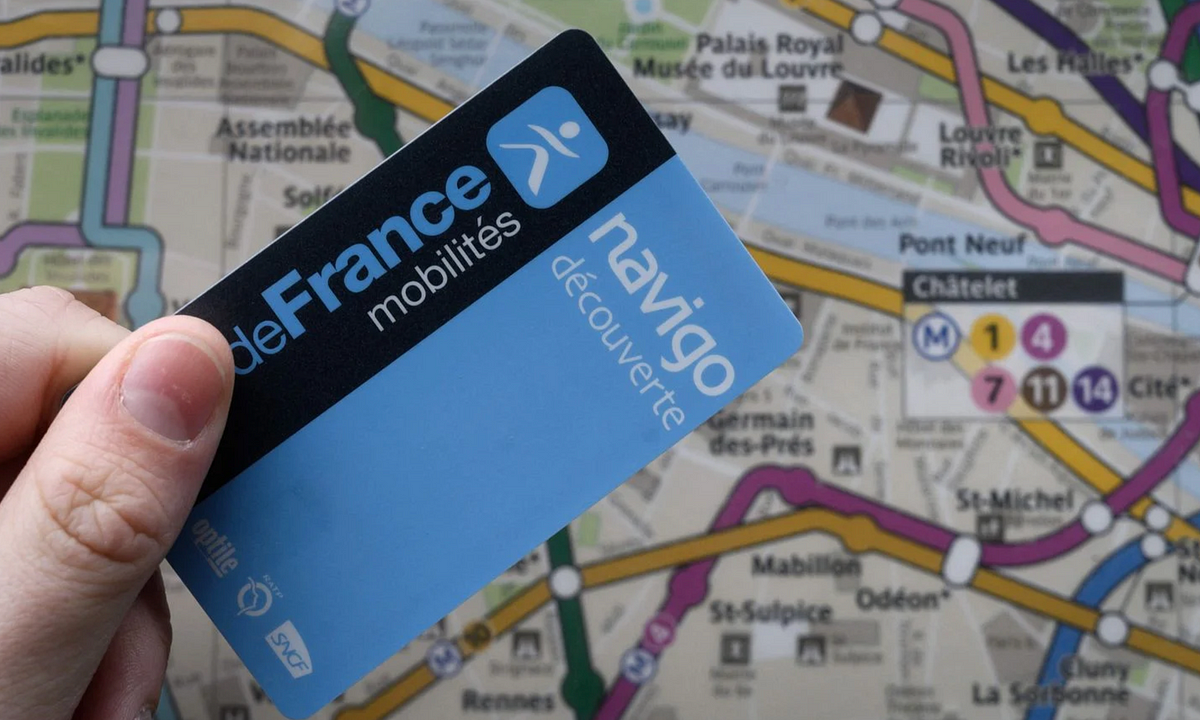
The experience with a ticket loading app revealed significant design flaws. Users found it confusing to load tickets as the app indicated completion prematurely, leading to mistakes. This resulted in penalties, not due to deliberate refusal to pay, but from miscommunication. The author reflects on the tendency to blame users rather than addressing design issues, suggesting that design plays a crucial role in usability. Poorly designed interfaces can create traps that punish users for failures originating from the system's complexity and lack of clarity.
Read at Medium
Unable to calculate read time
Collection
[
|
...
]