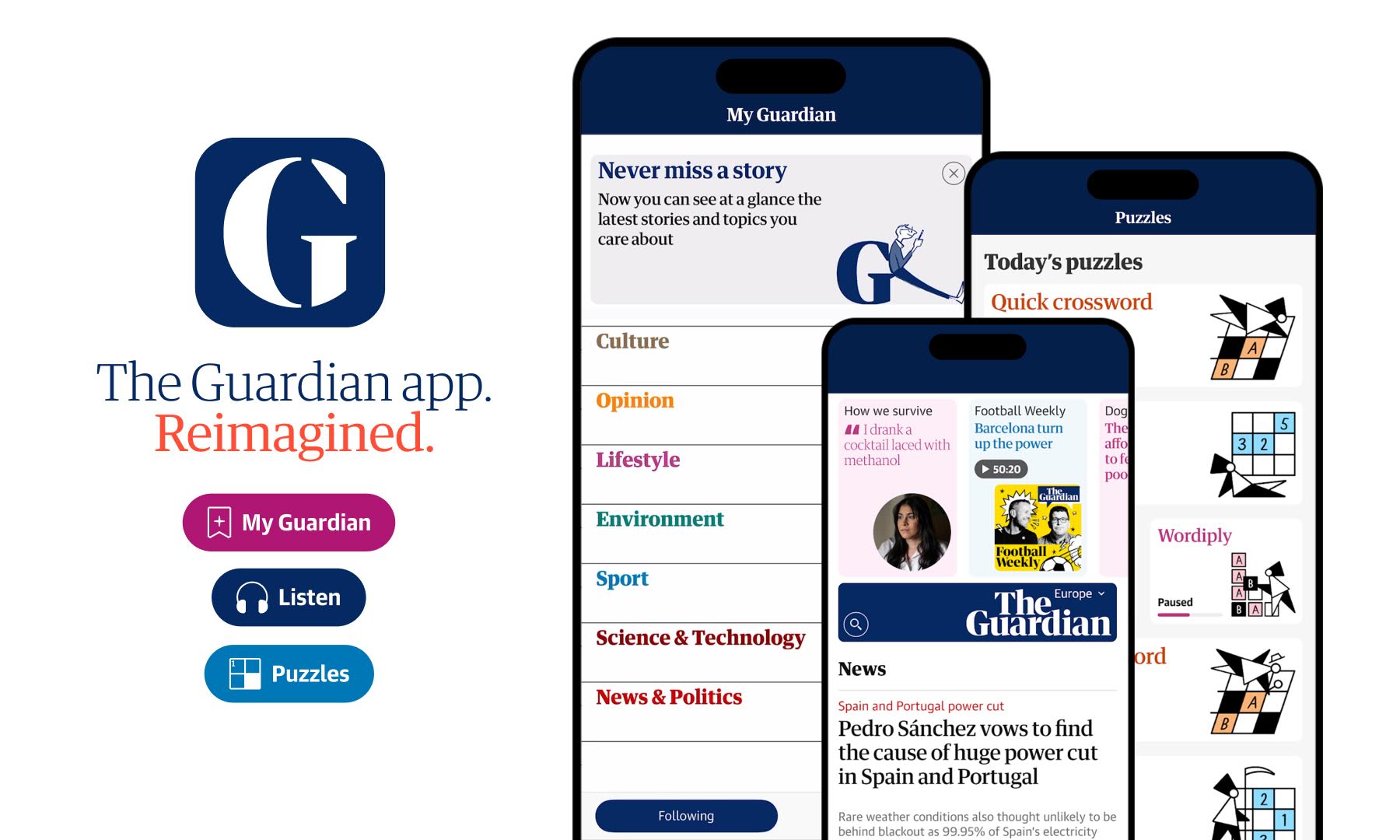
"Our last major redesign was in 2015 and since then website design and our understanding of user experience has evolved considerably."
"In 2025, we recognise that our audience is in a different place, with 75% of our digital readers visiting us daily using a mobile device."
"The Guardian as a brand has a very loyal audience, who care deeply about our journalism and how we serve it to them."
"We wanted 'a big bang moment' to showcase the improvements we made and new innovations, but also make sure that the experience felt familiar."
The Guardian's recent redesign focuses on improving mobile user experience, recognizing that 75% of their audience accesses content via mobile devices. Since the last major redesign in 2015, design principles and user expectations have changed significantly. The effort aims to merge web and app experiences while maintaining a familiar interface for loyal readers. Editorially, the redesign seeks to showcase the breadth of The Guardian's journalism in a visually appealing manner, with a staged rollout introduced to help audiences adjust to the changes more comfortably.
Read at Creative Bloq
Unable to calculate read time
Collection
[
|
...
]