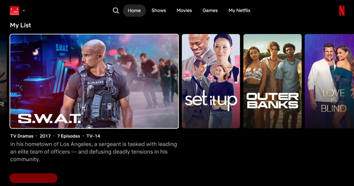
"Netflix's redesign aims to reduce choice paralysis by minimizing options on screen while enhancing the viewing experience with larger images and additional information."
"The 'Eclipse' layout repairs the overwhelming scrolling experience, channeling nostalgia while encouraging viewers to engage more with original content."
"Greg Peters highlights the improved recommendation algorithm's speed, while Eunice Kim compares its user understanding to TikTok's personalized 'For You' page."
"As Netflix sets a new standard, other streaming services might adopt similar layouts, reshaping the competitive streaming landscape."
Netflix is set to overhaul its homepage, dubbed 'Eclipse', in response to user experience challenges. The redesign reduces on-screen choices, focusing instead on delivering more engaging video content. By enlarging visuals and providing additional context through labels like 'Oscar nominee', Netflix aims to streamline how users find and select shows. With a quicker recommendation algorithm and a structure reminiscent of nostalgic video rental stores, the change is expected to not only enhance viewer satisfaction but also influence the broader streaming market dynamics.
Read at Vulture
Unable to calculate read time
Collection
[
|
...
]