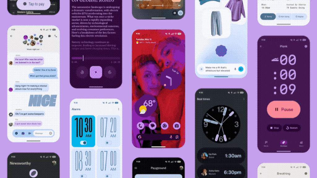
""It's kind of like the next evolution," says Vanessa Cho, VP, Google Design. "It's design with the soul. What I mean by that is it's [still] driven with deep purpose...but it also connects with you on the emotional level.""
Google has unveiled its third major revision to its design system, Material 3 Expressive, showcasing a shift towards a more maximalist aesthetic. This iteration emphasizes bolder colors, playful animations, and a rounder interface, all aimed at enhancing user experience. Notable changes include the Google Sans Flex Rounded typeface, dynamic button shapes, and interactive UI elements that respond in delightful ways. According to Vanessa Cho, this update is about combining deep design purpose with emotional connectivity, marking a significant evolution in Material Design's journey from a once minimalist approach to a more expressive and joyful one.
Read at Fast Company
Unable to calculate read time
Collection
[
|
...
]