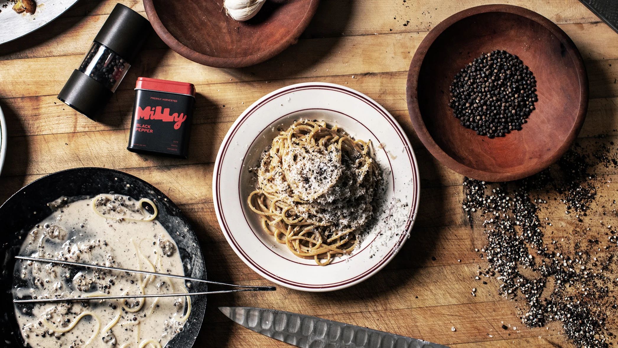
Milly launched on May 12 after a founder failed to find pepper packaged like other pantry staples such as olive oil or sea salt. The brand sells only whole peppercorns in black, white, and green, paired with matching pepper mills in coordinated colors. Products are sold through the company website, with pricing starting at $14 for a tin and increasing for sets that include mills and multiple pepper types. The branding and positioning emphasize intentional design, functionality, and visual appeal. A hand-lettered logo uses an organic, analog look with high-contrast stroke variation, mixed letter casing, and a distinctive script element, reflecting the handpicked nature of the peppercorns. Color accents on the tins align with each pepper’s flavor profile.
"The logo itself draws a playful contrast to category competitors, which offer run-of-the-mill serifs on white or black backgrounds (or red, for McCormick). Milly's in-house designer, Cassie Scowcroft, hand-lettered the final design, which has an organic, analog look, thanks to the high-contrast weight variations of its strokes, a mix of upper- and lowercase letters, and a script y. It's a nod to the fact that, according to the company, the peppercorns are handpicked."
#food-brand-design #consumer-packaged-goods #spices-and-seasonings #packaging-and-branding #peppercorns
Read at Fast Company
Unable to calculate read time
Collection
[
|
...
]