Elephant & Co. (ECO) had a devoted local following in Pune characterized by a strong vibe, good drinks, and a welcoming community. Rare Ideas redesigned the brand to make ECO future-ready while preserving its origin and community-led ethos. The redesign focused on narrative and repositioning before visuals, identifying ECO as a social anchor rather than merely a bar. The strategy amplified authenticity through a structured system that enables scaling, informs menu design, tone of voice, and staff interactions, and readies the brand for expansion into new markets without eroding its core identity.
"Success is often the most dangerous trap for a hospitality brand. Elephant & Co. (ECO) already possessed a loyal following in Pune, India. Locals loved the vibe. The drinks were great. The community felt at home. So, why change anything? Stagnation often disguises itself as stability. Brands that refuse to evolve eventually fade into the background."
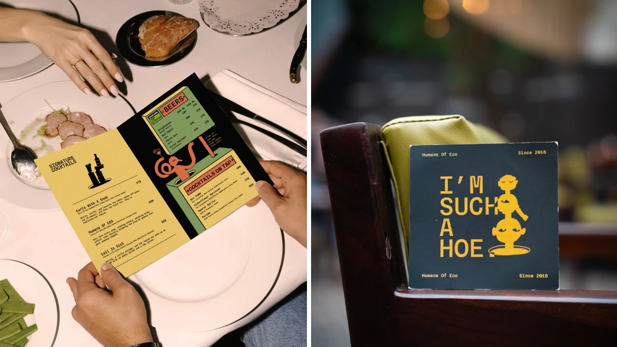
"A "community-led ethos" is hard to manufacture. You cannot simply design authenticity. However, you can design a system that amplifies it. The Elephant & Co. brand redesign succeeds because it respects the brand's origin story. It takes the chaotic energy of a beloved local haunt and gives it structure. This allows the brand to scale. It prepares the business for new markets. Yet, it keeps the soul intact."
"Rare Ideas began with the narrative rather than the visuals. Most agencies rush to the logo design. However, a pretty logo does not solve business problems. The Elephant & Co. brand redesign rests on a solid foundation of repositioning. The studio identified the core truth of the brand. ECO is not just a bar. It is a social anchor. Therefore, the communication strategy had to reflect this role. The narrative needed to shift from "a cool place to hang out" to a "community-driven institution.""
Read at WE AND THE COLOR
Unable to calculate read time
Collection
[
|
...
]