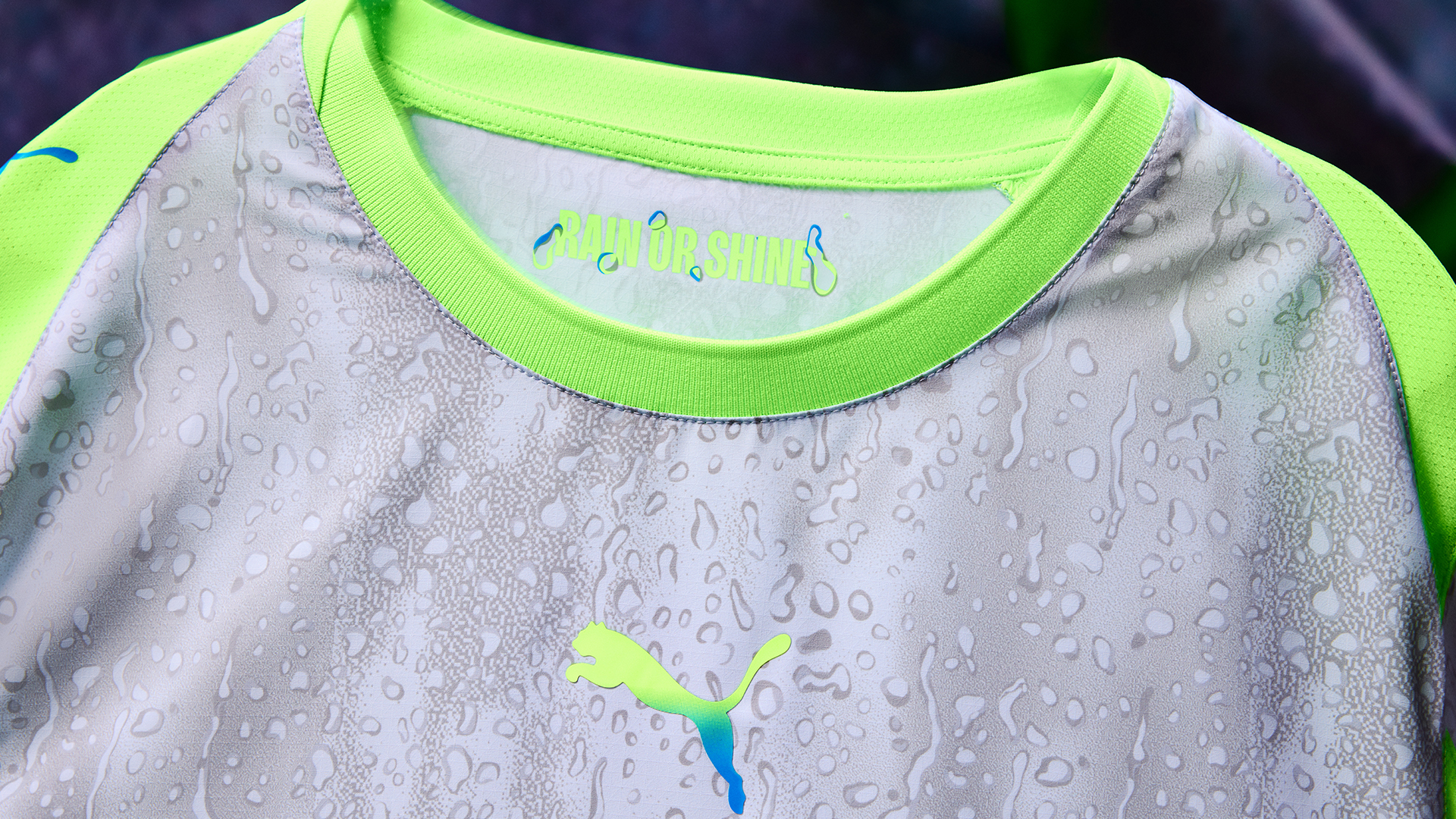
"The Manchester City 2025/26 third kit combines a rain graphic with fluorescent hues, making it one of the most divisive kits in recent memory, truly a hard sell."
"The kit features a green-to-blue gradient running down the centralised cat and club crest into the socks, creating a cohesive look reminiscent of the 2000-2002 away shirt."
"Puma's innovation dives deep into a raindrop theme, asserting that even when it rains, Manchester shines - a bold representation of the city's enduring spirit."
"Detractors might argue against combinations of raindrops or grey-green palettes, but history shows that worst-looking kits can also propel teams to success."
The Manchester City 2025/26 third kit features a distinctive rain graphic in fluorescent hues, sparking polarized opinions among fans. Previous kits were appreciated for their simplicity and aesthetics, while this one embodies a newfound creativity, referencing past designs. Notably, the kit includes a gradient from green to blue, linking the crest and socks in a unified look. Puma encapsulates a message representing Manchester's resilience: "even when it rains, we shine." While some may criticize the choice of colors and design, history reveals that unconventional kits can sometimes lead to unexpected success.
Read at www.fourfourtwo.com
Unable to calculate read time
Collection
[
|
...
]