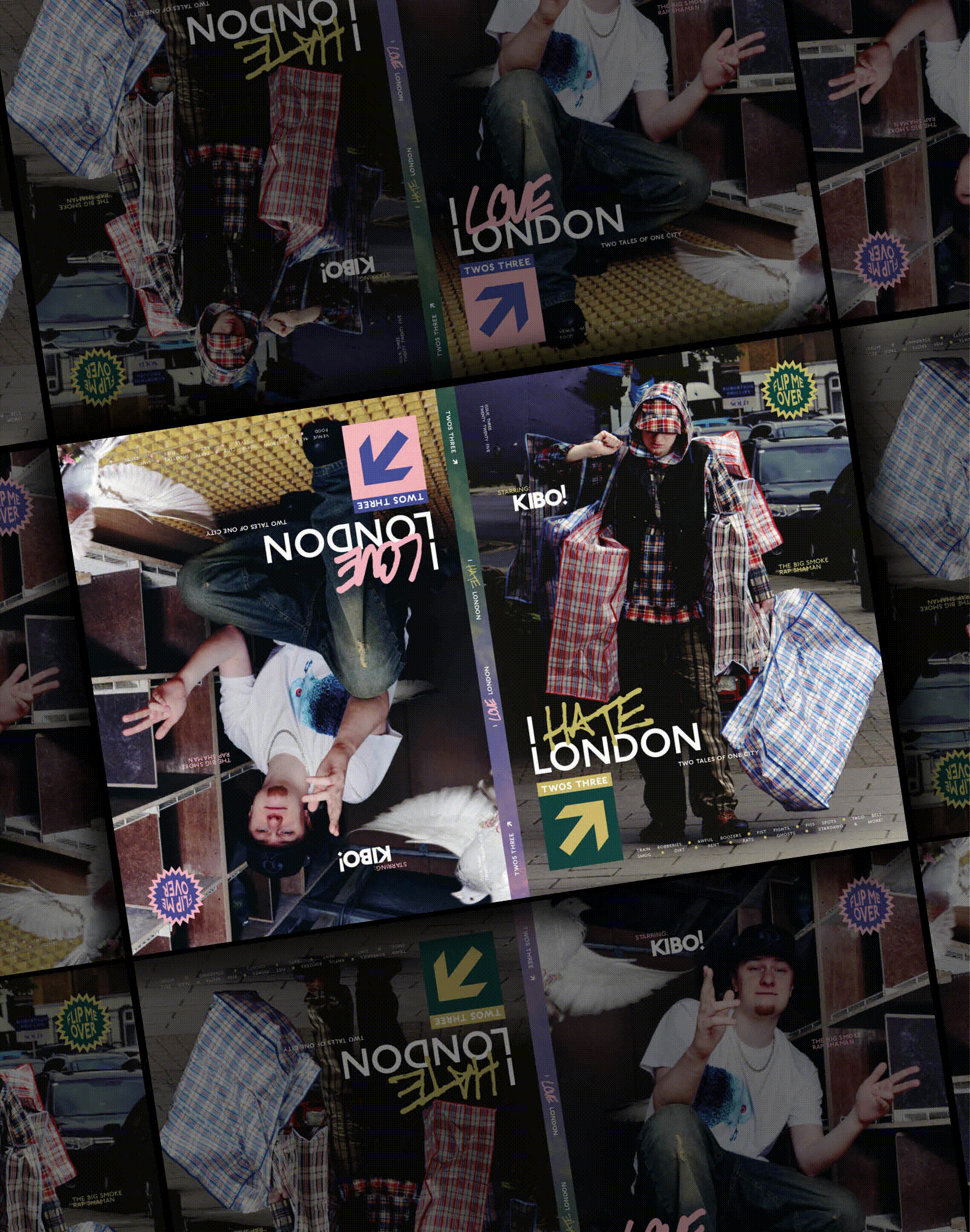
"Utilising hand scanned textures of the signs, walls, windows, toilet stalls, you name it, creates a textile library inside of its pages, a magazine literally made of London."
"Twos incorporates opposite colour schemes: pink and blue for love, the inverse green and gold for hate."
"The hate side of Twos takes on the spirit of William Cobbett, a radical 'pamphleteer' in the early 1800s who described London as The Great Wen."
"This isn't a coffee table book you should buy to flex on houseguests. It's designed to be read - on the toilet, on the tube, wherever."
Twos magazine employs hand scanned textures from various London elements to create a unique textile library within its pages. It utilizes iconic visual language such as the TFL network's 1913 font for its headlines, and the redesigned logo is inspired by London tube signage. The publication contrasts love and hate through distinct color schemes, with love represented by pink and blue while hate uses green and gold. Topics covered range from local culture to social commentary, aiming to encapsulate the emotional spectrum of London living.
Read at Itsnicethat
Unable to calculate read time
Collection
[
|
...
]