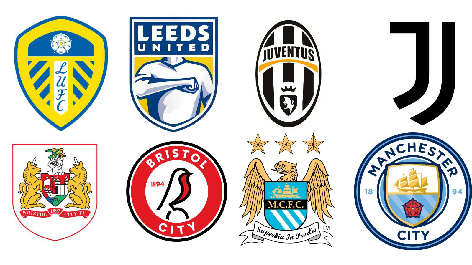
Football crests originated as historical, regional and emotional symbols stitched into kits and club identity, often reflecting local heraldry and long-standing traditions. Modern branding has shifted toward streamlined, merchandise-friendly marks designed for global lifestyle appeal, exemplified by Juventus's 2017 switch to a minimalist "J." That shift improves cross-platform and retail visibility but provokes fan backlash by reducing storytelling and emotional attachment. Industry designers note that commercial rebrands that ignore heritage can alienate core supporters, and examples from luxury brands show companies sometimes return to heritage elements after minimalism provokes negative reaction.
"Once upon a time, football crests were sacred. They weren't "logos" at all. They were heirlooms, passed down like pocket watches, stitched into kits, carved into memory, it's safe to say for many it was as if it was tattooed into the skin (both figuratively and literally). Juventus had its ornate oval with black-and-white stripes. Leeds had the white rose of Yorkshire. Even the smallest grassroots club clung to some medieval-looking shield. Indeed, many of the best football logos are seeped in history."
""And if you treat crests (and clubs) like lifestyle brands in the hope of attracting new audiences, you risk stripping away the story. In designing for customers, you risk alienating the fans." Ellams has seen this movie before. "Jaguar faced a backlash when it sidelined its own brand heritage (the iconic leaping cat) in favour of a cleaner wordmark; when Burberry did something similar, it ended up reintroducing heritage elements after years of minimalism.""
Read at Creative Bloq
Unable to calculate read time
Collection
[
|
...
]