"When we consider the subway, it's often for reasons that have to do with decay and deterioration. The switches are outdated. The elevators are broken. The train is late (again). Of course it could be better, but rarely do we pause to take in what the system does right. Its 25 lines, 472 stations, and 665 miles of track traverse the city and offer a tremendous amount of mobility."
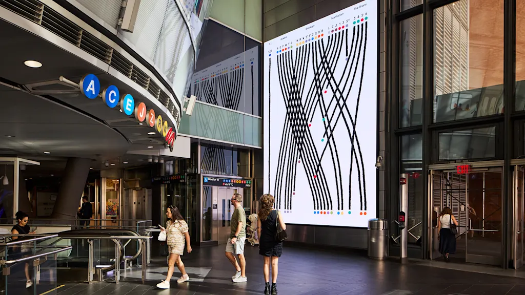
"The graphics show where the trains travel, converge, and go their own ways as well as various facts about the system, from the age and length of lines to the ones that go above ground or never see the sun. Lupi has turned this information into a charming animation that makes visible what most New Yorkers take for granted. "I have this little bit of a curse that I see data everywhere," Lupi says."
A Data Love Letter to the Subway is a two-minute digital animation installed at the Fulton Street subway station that celebrates the New York City Transit system. It maps 25 lines, 472 stations, and 665 miles of track, showing where trains travel, converge, and diverge while presenting facts such as line ages, lengths, and which lines run above ground or never see sunlight. The installation draws inspiration from Craigslist Missed Connections and the city's open data portal. The piece appears on 50 advertising screens throughout the station, plays hourly through December, and adapts animations to fit varied screen sizes, with occasional synchronized moments across displays.
Read at Fast Company
Unable to calculate read time
Collection
[
|
...
]