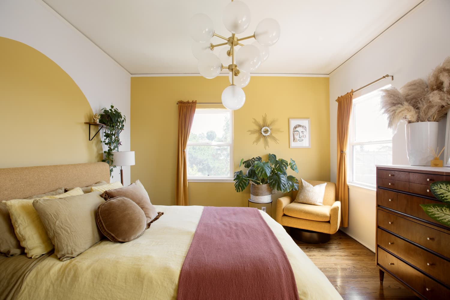
"âSeventies design is less about a strict palette of earth tones and more about creating a feeling,â he says. âThe essence of the '70s is a mellow, laid-back energy that invites relaxation.â"
"âDetails like pinch-pleated drapes, wood paneling, and folded blankets recall the cozy aesthetic of old Polaroids and family scrapbooks. That's the magic of the '70s: a design language that feels familiar, emotional, and somewhat intangible.â"
The article discusses the resurgence of 1970s interior design colors like avocado green and harvest gold. These hues are reappearing on various home elements, embodying a blend of warmth and comfort. Experts clarify that capturing the '70s vibe is more about evoking feelings rather than adhering to precise color palettes. The characteristics of this period included natural materials and a cozy aesthetic, making spaces feel intuitive and emotionally connected. The essence of '70s décor invites a relaxed atmosphere, celebrating nostalgia and individuality in home design.
Read at Apartment Therapy
Unable to calculate read time
Collection
[
|
...
]